
Colouring technical illustrations

Colouring technical illustrations

Home Forums General Questions Colouring technical illustrations

Viewing 15 posts - 51 through 65 (of 65 total)
  • Author
    Posts
  • #619583
    Chris Gunn
    Participant
      @chrisgunn36534

      This is a long way from the 2 ladies who used to sit close to me in Timsons drawing office in the mid sixties. Timsons built bespoke printing machines, and Jess and Jean were employed to prepare the proposal drawings. Jean would use her box of Windsor and Newton water colours and a fine brush to colour in the drawings, and Jean would annotate the drawings in black ink in beautiful copperplate. We had a very demanding boss, and sometimes the drawings were re-done several times to make sure the information was understandable. Here colours did not matter so much, as the drawings were not depicting the materials used, but the functions of the various parts of the machines.

      Chris Gunn

      #619584
      JasonB
      Moderator
        @jasonb

        I'm not sure of the "colour space" that it uses.

        I've done a little video which will compensate for screen differences as it will all be on the same screen. On the left is a part coloured by entering Dave's RGB values which can be seen on the right side of the screen.

        I then get Michael's recent post up on the right and move the slider in Alibre up to "lighten" the colour but the RGB value change is certainly not proportional.

        Finally enter half the RGB values and end up with poo brown rather than a washed out gamboge. I seem to remember mixing Plasticine as a kid had similar results!  If I double all the values I get canary yellow. The very lightest tint from the slider is something like 255, 254, 253 and the darkest 9, 5, 0 before going to white or black respectively.

        Edited By JasonB on 03/11/2022 11:46:04

        #619589
        Michael Gilligan
        Participant
          @michaelgilligan61133

          Sorry, Jason … I see the problem

          Your slider is [quite properly] adjusting the saturation of the colour, which is like adding water to your paint.

          … when you are mixing light, the result can be expressed in terms of Hue, Saturation, and Brightness

          .

          I would struggle to describe it in a forum post, but thankfully Wikipedia does a pretty good job, here:

          **LINK**

          https://en.wikipedia.org/wiki/HSL_and_HSV

          MichaelG.

          .

          Incidentally, the ‘Colour Space’ determines the available gamut [palette] for display

          … in my 2D, posted earlier, it is sRGB and that’s what determines the particular shape of the triangular area on the graph.

          #619596
          Michael Gilligan
          Participant
            @michaelgilligan61133

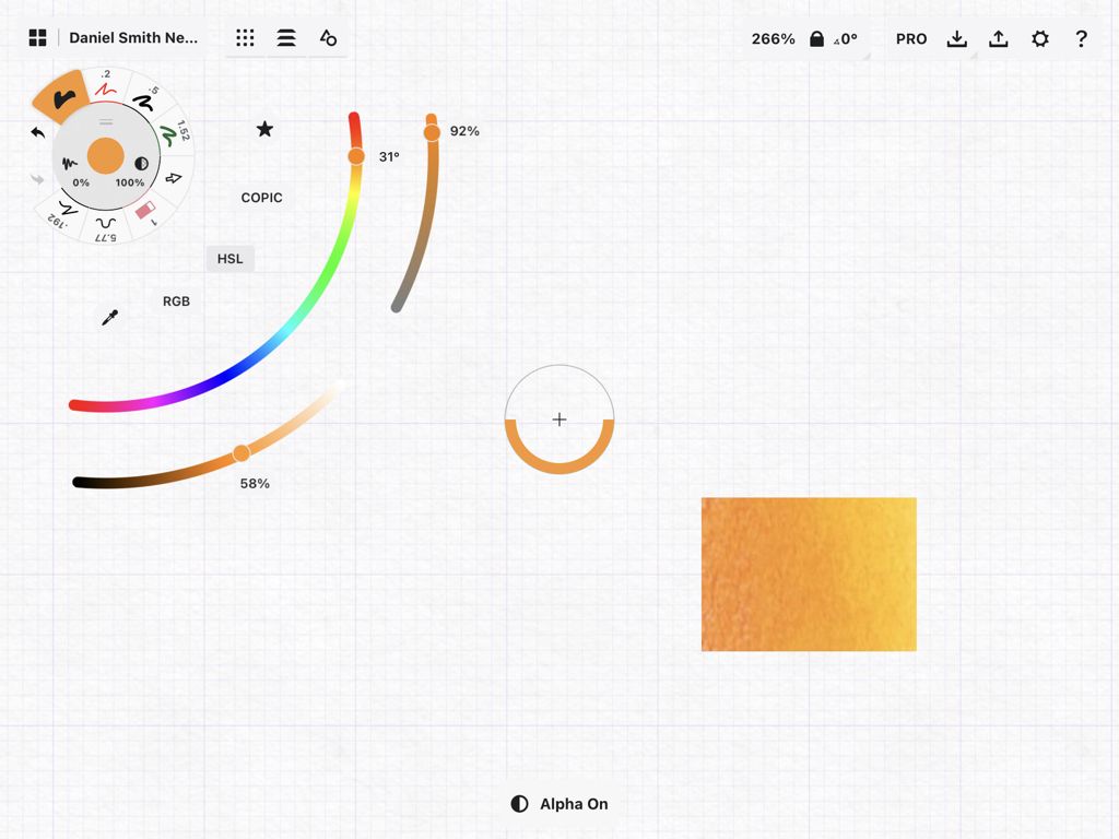
            This is a screen-shot from the [quite astonishing] Concepts App, which I am currently trying to learn to use.

            .

            55840d79-eb92-40b0-9266-28c734be01ac.jpeg

            .

            The colour half-filling the ‘sight’ was selected using the eye-dropper tool, and the picker menu is currently displaying HSL … alternative displays are RGB and COPIC

            This is just the way of selecting the colour for drawing/painting on an ‘infinite canvas’ … there is much, much, more to the App.

            MichaelG.

            .

            Ref. __ https://concepts.app/en/ios/manual/yourworkspace#thestatusbar

            Edited By Michael Gilligan on 03/11/2022 13:31:04

            #619601
            SillyOldDuffer
            Moderator
              @sillyoldduffer
              Posted by Michael Gilligan on 03/11/2022 12:44:35:

              Sorry, Jason … I see the problem

              Your slider is [quite properly] adjusting the saturation of the colour, which is like adding water to your paint.

              Although computer colour codes are often given as a triplet of hexadecimal numbers representing Red, Green and Blue, software usually silently does RGBA, in which a fourth hex number is added to control transparency, or 'alpha'.

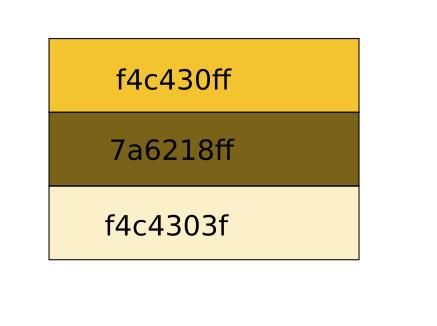
              As Jason said, proportionally halving an RGB triplet doesn't produce a lighter shade of the same colour, which is what I expected. Saffron as an example:

              halfsaffron.jpg

              Halving the RGB values of Saffron to 7a6218 produces a mucky khaki like colour. As it doesn't seem to have an official name, I suggest "Duffer's Poo" in my honour, and, by popular demand, all model locomotives will be finished in it.

              F4C430 is still Saffron, but F4C4303F is the shade of Saffron produced by being 50% transparent. In hexadecimal half FF is 3F. Hex reveals the RGB values, the same number in decimal (16041008) has to be decoded.

              Michael mentions several other systems – they all make my head hurt!

              Dave

              #619603
              Michael Gilligan
              Participant
                @michaelgilligan61133
                Posted by SillyOldDuffer on 03/11/2022 13:51:54:

                […]

                F4C430 is still Saffron, but F4C4303F is the shade of Saffron produced by being 50% transparent. In hexadecimal half FF is 3F.

                .

                Thanks for that succinct explanation, Dave yes

                3F duly noted, for my continuing attempts to learn something.

                MichaelG.

                #619610
                Keith Petley
                Participant
                  @keithpetley53472
                  Posted by Michael Gilligan on 03/11/2022 14:16:06:

                  Posted by SillyOldDuffer on 03/11/2022 13:51:54:

                  […]

                  F4C430 is still Saffron, but F4C4303F is the shade of Saffron produced by being 50% transparent. In hexadecimal half FF is 3F.

                  .

                  Thanks for that succinct explanation, Dave yes

                  3F duly noted, for my continuing attempts to learn something.

                  MichaelG.

                  Dave,

                  Half of FF is 7F (well 7F.8 to be exact) – so I assume that 3F represents 25%.

                  Which brings the question 25% of what? Is it 25% "pigment", implying the remaining 75% is transparent?

                  Would this then be described as 25% or 75% transparent – a problem neatly avoided by using 50% as an example!

                  Keith

                  #619617
                  SillyOldDuffer
                  Moderator
                    @sillyoldduffer
                    Posted by Keith Petley on 03/11/2022 15:11:13:

                    Posted by Michael Gilligan on 03/11/2022 14:16:06:

                    Posted by SillyOldDuffer on 03/11/2022 13:51:54:

                    […]

                    F4C430 is still Saffron, but F4C4303F is the shade of Saffron produced by being 50% transparent. In hexadecimal half FF is 3F.

                    .

                    Dave,

                    Half of FF is 7F (well 7F.8 to be exact) – so I assume that 3F represents 25%.

                    Which brings the question 25% of what? Is it 25% "pigment", implying the remaining 75% is transparent?

                    Would this then be described as 25% or 75% transparent – a problem neatly avoided by using 50% as an example!

                    Keith

                    Well spotted Keith, the mistake is doubly inexcusable because I used a calculator! I guess I double-clicked.

                    Anyway I'd describe #3f as being 25% opaque and 75% transparent because screen colours are like the projection on a cinema screen, illuminations.

                    Counter-intuitive I think. Illuminations are opposite to normal vision where our perception of colour, such as admiring a flower, results from the brain processing light frequencies that have been absorbed. Mixing pigment colours causes the result to get darker, whilst mixing coloured light causes the result to get brighter. The two ways colours work need a mental back-flip like reversing a car with a mirror, or undoing an upside down bolt.

                    Being illuminated means a computer screen isn't really opaque or transparent, rather it's an illusion where brightness is increased to make lighter shades and reduced to make darker.

                    Vision is very strange. Black absorbs everything, so it's not really a colour at all. We seem to detect the absence of light. Even more confusing, we can't see it! Light travelling through space is invisible until it hits something. What we perceive as shape and colour are always the result of reflections. It seems shapes and colour are the product of our brains making sense of differences due to light bouncing, or not bouncing. Another oddity is that the image in our eyes is upside down, and this is corrected by the brain so we fink the world makes sense. However, when someone wears a pair of inverting specs, the world is upside down until the brain relearns and we adapt to the glasses. When his inverting glasses are removed, the victim sees the world upside down until the brain adapts back again, which takes about an hour to adapt. It means that what we see isn't really real, it's just a useful approximation!

                    Dave

                    #619635
                    Nigel Graham 2
                    Participant
                      @nigelgraham2

                      We are talking about drawing-office practices from 100 and more years ago. I wonder how "standard" the colours were, since things like RAL values and digital versions were yet to come.

                      #619637
                      Nick Wheeler
                      Participant
                        @nickwheeler
                        Posted by Nigel Graham 2 on 03/11/2022 18:11:49:

                        We are talking about drawing-office practices from 100 and more years ago. I wonder how "standard" the colours were, since things like RAL values and digital versions were yet to come.

                        I suspect the procedure was acquire the colour from the stores, mix some and maybe check with the artist next to you if it looked right.

                        Edited By Nicholas Wheeler 1 on 03/11/2022 18:18:27

                        #619650
                        Michael Gilligan
                        Participant
                          @michaelgilligan61133
                          Posted by Nigel Graham 2 on 03/11/2022 18:11:49:

                          We are talking about drawing-office practices from 100 and more years ago. I wonder how "standard" the colours were, since things like RAL values and digital versions were yet to come.

                          .

                          That is exactly why I asked the opening question, and why it is [for me at least] necessary to use the tools at our disposal, to help understand what we now see, and how it might compare with what they intended at the time.

                          When I returned from this afternoon’s shopping trip, there was a very interesting eMail from my friendly Librarian at ‘John Rylands’ … she has located a book in their vast collection, by William Savage, called ‘Practical hints on decorative printing’ dated 1822.

                          To quote her first-hand observation:

                          “ Your Gamboge appears to be a faded lime green on their plates ! ”

                          Now … at 1822, this is probably natural Gamboge … since which time, there have been several attempts to produce a convincing and stable synthetic alternative.

                          ”Our” illustrators were probably [consciously or unconsciously] in the first wave of those using Analine/Azo dyes and pigments.

                          All I can do, Nigel, is repeat that I find this interesting and worthy of some research.

                          MichaelG.

                          #619651
                          Michael Gilligan
                          Participant
                            @michaelgilligan61133

                            Thanks for the ‘sanity check’ on 3F Keith yes

                            You have saved this old brain a lot of befuddlement

                            MichaelG.

                            #619654
                            Michael Gilligan
                            Participant
                              @michaelgilligan61133

                              Posted by SillyOldDuffer on 03/11/2022 16:00:21:

                              […]

                              It means that what we see isn't really real, it's just a useful approximation!

                              .

                              … and that is what begat the CIE 1931 diagram

                              There is, inevitably, a Wikipedia page about it … but try this one as an alternative:

                              **LINK**

                              https://medium.com/hipster-color-science/a-beginners-guide-to-colorimetry-401f1830b65a

                              MichaelG.

                              #619672
                              Michael Gilligan
                              Participant
                                @michaelgilligan61133
                                Posted by Michael Gilligan on 03/11/2022 20:01:15:

                                […]

                                You have saved this old brain a lot of befuddlement

                                .

                                This on-line tool looks like it might be useful in that respect

                                **LINK** https://mdigi.tools/lighten-color/#2661d5

                                MichaelG.

                                .

                                Edit: __ The whole suite of tools there looks very promising !!

                                Edited By Michael Gilligan on 03/11/2022 23:03:35

                                #619764
                                bernard towers
                                Participant
                                  @bernardtowers37738

                                  just been in the loft and found a tastefully coloured in 28 x 19 GA drawing by Berol for a Midland 4-4-0 of 1901, rather well done. It also has some dims and various calcs but they do not make it seem too busy. It says on it that it is an advert for their torquoise line of pens. Doesn't seem to have a date but would think around 70s 80s. Will now have to find a frame.

                                Viewing 15 posts - 51 through 65 (of 65 total)
                                • Please log in to reply to this topic. Registering is free and easy using the links on the menu at the top of this page.

                                Latest Replies

                                Home Forums General Questions Topics

                                Viewing 25 topics - 1 through 25 (of 25 total)
                                Viewing 25 topics - 1 through 25 (of 25 total)

                                View full reply list.