What Makes a Good Photo for Model Engineers’ Workshop
What Makes a Good Photo for Model Engineers’ Workshop
- This topic has 39 replies, 16 voices, and was last updated 21 October 2016 at 08:35 by
 Neil Wyatt.


- Please log in to reply to this topic. Registering is free and easy using the links on the menu at the top of this page.
Latest Replies
-
- Topic
- Voices
- Last Post
-
-
Baffled by flatted-shank spot weld drills
Started by:
Bill Phinn
in: Workshop Tools and Tooling
- 4
-
21 June 2026 at 19:30
DC31k
-
Taylor Hobson Pantograph Engraver Model D
1
2
Started by:
jaCK Hobson
in: Workshop Tools and Tooling
- 9
-
21 June 2026 at 17:41
jaCK Hobson
-
Help identifying a mystery thread
Started by:
Beardy Mike
in: Beginners questions
- 3
-
21 June 2026 at 16:55
Beardy Mike
-
Gas Tap Valves. Vintage
1
2
Started by:
dee
in: Related Hobbies including Vehicle Restoration
- 17
-
21 June 2026 at 16:15
Howard Lewis
-
Rapidor Manchester re-build
Started by:
homecat88
in: Introduce Yourself – New members start here!
- 1
-
21 June 2026 at 15:57
homecat88
-
Unwanted Car Software Update
Started by:
Chris Crew
in: The Tea Room
- 7
-
21 June 2026 at 15:53
Howard Lewis
-
Emco Compact 5 milling table restoration
Started by:
rikt
in: Manual machine tools
- 5
-
21 June 2026 at 15:39
Eric Lucas
-
Is improvement work on this forum/website still ongoing?
1
2
…
5
6
Started by:
Ian P
in: Website Questions, Comments, and Suggestions
- 38
-
21 June 2026 at 15:28
peak4
-
Firehole door for 5inch gauge
Started by:
Perko7
in: Locomotives
- 3
-
21 June 2026 at 15:22
Weary
-
New Toy Day
Started by:
Julie Ann
in: Workshop Tools and Tooling
- 10
-
21 June 2026 at 15:10
old mart
-
Greetings
Started by:
dee
in: Introduce Yourself – New members start here!
- 7
-
21 June 2026 at 13:53
dobbs57
-
All things Beaver Mill
1
2
…
9
10
Started by:
Robert James 3
in: Manual machine tools
- 43
-
21 June 2026 at 13:00
Andrew Skinner
-
Comm Ads
Started by:
bernard towers
in: Website Questions, Comments, and Suggestions
- 4
-
21 June 2026 at 09:06
Charles Lamont
-
Green Dragon Sustainable Fuel
Started by:
Neil Wyatt
in: Locomotives
- 13
-
21 June 2026 at 09:00
Nealeb
-
Renewing AA cover.
Started by:
Grizzly bear
in: The Tea Room
- 13
-
20 June 2026 at 23:48
howardb
-
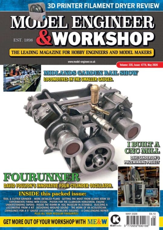
The Latest INDEX to Model Engineer & Workshop (Also past issues of MEW)
1
2
3
Started by:
David Frith
in: Model Engineer & Workshop
- 7
-
20 June 2026 at 22:20
David Frith
-
Freebies (Nucleo)
Started by:
duncan webster 1
in: Electronics in the Workshop
- 1
-
20 June 2026 at 22:19
duncan webster 1
-
Di Palo Milling machine Manual
Started by:
Paul Scholey
in: Manual machine tools
- 3
-
20 June 2026 at 20:19
Paul Scholey
-
My week this week! My workshop videos
1
2
…
12
13
Started by:
Phil Whitley
in: The Tea Room
- 16
-
20 June 2026 at 16:07
Phil Whitley
-
Band saw
1
2
3
Started by:
Peter Simpson 3
in: Beginners questions
- 24
-
20 June 2026 at 11:52
Chris Kaminski
-
ML7 – Zeroing the Topslide?
1
2
Started by:
Dr_GMJN
in: Workshop Techniques
- 22
-
20 June 2026 at 03:35
alecs
-
Windows 10 disaster
Started by:
Glyn Davies
in: The Tea Room
- 7
-
20 June 2026 at 02:26
mark costello 1
-
Lathe cutting aggressive taper
Started by:
Lee Kennedy
in: Manual machine tools
- 15
-
20 June 2026 at 02:25
alecs
-
Bridgeport Series 1 CNC
1
2
3
Started by:
tomcnc
in: CNC machines, Home builds, Conversions, ELS, automation, software, etc tools
- 12
-
20 June 2026 at 00:20
tomcnc
-
How Good Are 3D Printers?
1
2
Started by:
Neil Wyatt
in: 3D Printers and 3D Printing
- 15
-
19 June 2026 at 22:49
Bazyle
-
Baffled by flatted-shank spot weld drills
Latest Issue
Newsletter Sign-up
Latest Replies
- Baffled by flatted-shank spot weld drills
- Taylor Hobson Pantograph Engraver Model D
- Help identifying a mystery thread
- Gas Tap Valves. Vintage
- Rapidor Manchester re-build
- Unwanted Car Software Update
- Emco Compact 5 milling table restoration
- Is improvement work on this forum/website still ongoing?
- Firehole door for 5inch gauge
- New Toy Day

