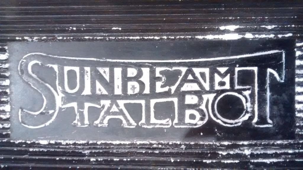
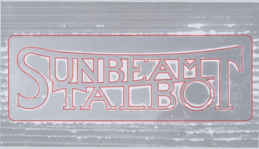
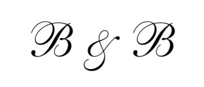
The idea that a designer in the early 20th century based a trade-mark design on a 'font' is really the wrong starting point – sorry. There was not a wide variety of 'font' examples around, in any event, unless you were a professional printer in a fairly specialised corner of the trade. Look at all the motorcycle logos – Norton, Triumph, New Imperial, Rudge, Velocette, Indian, ABC, BSA, you name it, they are all designed from scratch.
And I use 'font' in quotes because the term properly applies to one particular size of one typeface. The style is that of the typeface, or face once you have established the idea, and using 'font' instead reveals (to typography nerds) that you are not quite as up-to-speed as you might want us to think.
The term originates with the casting process ( a form of mass production centuries before anyone started making hand guns or motorcars, or even naval pulley blocks) – and the French term for the process is fondre. And cast iron in French is fonte – the same word for a different product.
And finally, I suggest that the lettering you need could usefully be created in metal using a piercing saw, once you have the outline tracing sorted. Appropriate to the period, not like all this digital stuff.
Cheers, Tim
Edited By Tim Stevens on 31/08/2016 20:54:59
Hopper.
