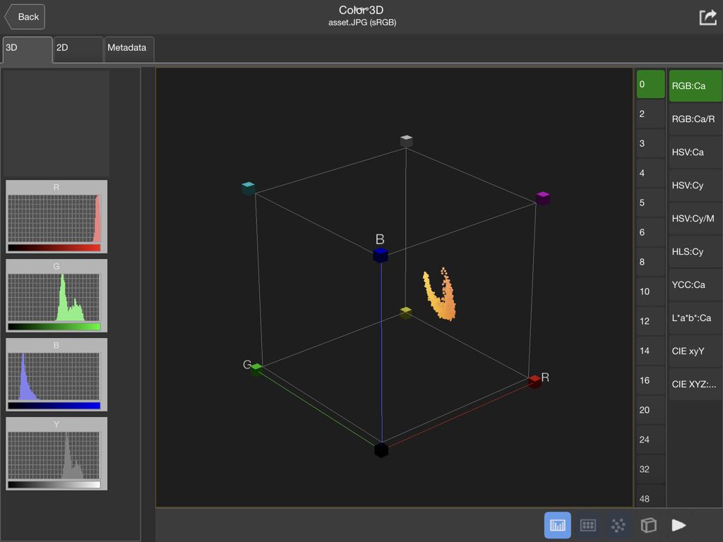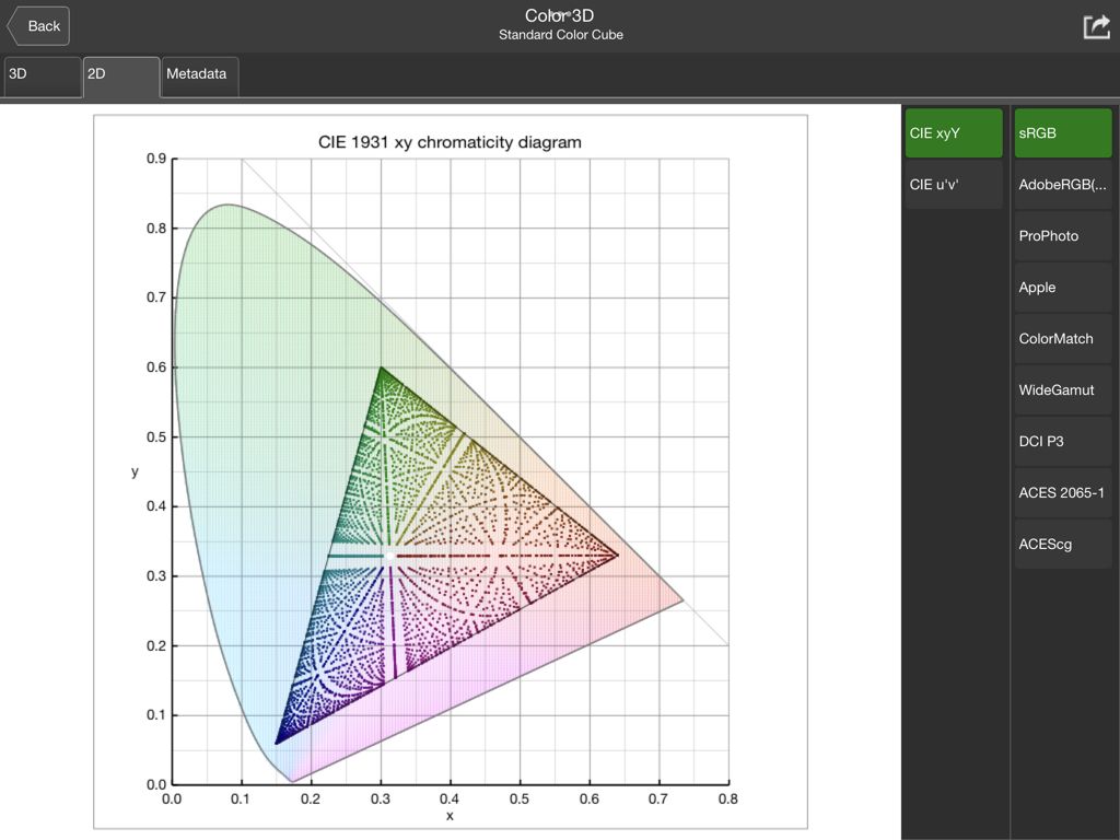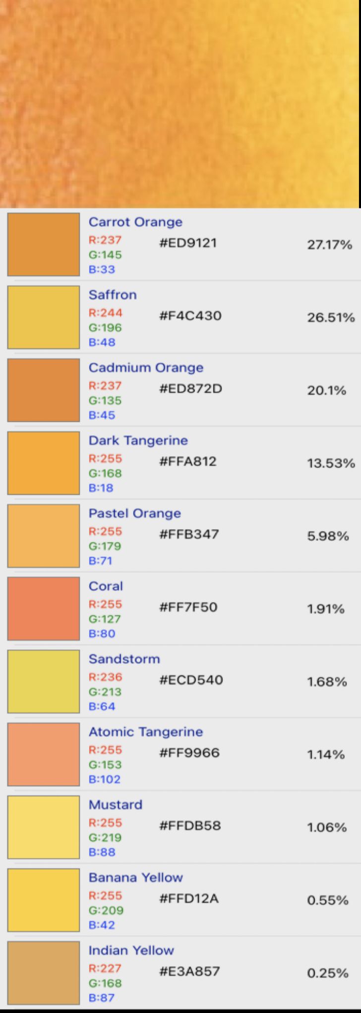
I think we are in danger of getting too bogged down in technicalities over colours-to-umpteen-decimal-places, or BS standards that might be the BSI type or the other – or simply non-existent.
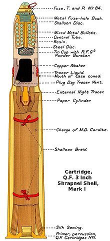
The original point 100+ years ago was sensibly consistent, tinted drawings to show those you hope will buy your company's products; be they small engines or whacking great railway bridges!
The drawing-office bought its materials from wherever, quite possibly the nearest art stockists; the draughtsman himself (possibly herself, at least as a tracer) mixed the ink or colour wash.
RAL probably stood for anything but paint tints; the nearest "calibration" might have been matching some colour swatches, and the drawing-office optical-wavelength meter was the Eye and Brain, Hominim, Mk.1.
If you want to make your drawings look near those in your prototype manufacturer's catalogue or contract documents, simply go to your nearest art-shop and buy the colours listed in those old text-books; or nearest available now! Oh, and note Jason's instruction on colour-wash technique; and brush up on your pen skills..
If you try it by CAD, do remember to remove the "glue lines" between the generated elements…..
RAL indeed……
++++
Hopper –
Ah, Bevis & Low. Yes, I have a copy, but one of the modern editions: Fifteenth Edition, 1919.
These old books are invaluable references if you are making models of machinery of their time, especially if you don't have full drawings for them.
bernard towers.
