Colouring technical illustrations

Advert

Colouring technical illustrations

Home Forums General Questions Colouring technical illustrations

Viewing 25 posts - 1 through 25 (of 65 total)
  • Author
    Posts
  • #619191
    Michael Gilligan
    Participant
      @michaelgilligan61133

      In a currently-running thread : **LINK**

      https://www.model-engineer.co.uk/forums/postings.asp?th=183806&p=1

      Jason posted a link to a coloured drawing from 1903 … and that has set me wondering if there a recognised ‘Standard’ for the representation of different materials? … and if so, who maintains it ?

      The best I have managed to find so-far is this one illustration:

      https://wellcomecollection.org/works/e2fk372s

      https://wellcomecollection.org/works/e2fk372s

      … but six materials doth not a useful standard make

      It’s not important … just interesting

      MichaelG.

      Edited By Michael Gilligan on 30/10/2022 20:30:33

      Advert
      #28902
      Michael Gilligan
      Participant
        @michaelgilligan61133

        Is there a Standard ? …

        #619196
        JasonB
        Moderator
          @jasonb

          When I was at college we did some water colour renderings of some of the designs. Some done on dyeline prints on a heavy paper others on HP watercolour paper The teacher was an old boy architect and had some nicely done examples of his work. There were certainly specific colours for the various building materials.

          Andrew has previously posted some nicely coloured elevations of an engine that his father (or grandfather) did. About half way down this album

          Some good ones here, there used to be a Japanese site with these on that you could zoom right in to but doe snot seem to be working now. Unless Michael wants a challenge http://gazo.dl.itc.u-tokyo.ac.jp/petit/category/cate04.html


          Edited By JasonB on 30/10/2022 20:52:37

          #619199
          Michael Gilligan
          Participant
            @michaelgilligan61133

            Thanks, Jason [and Andrew]

            MichaelG.

            #619201
            peak4
            Participant
              @peak4
              Posted by JasonB on 30/10/2022 20:41:26:

              Some good ones here, there used to be a Japanese site with these on that you could zoom right in to but doe snot seem to be working now. Unless Michael wants a challenge http://gazo.dl.itc.u-tokyo.ac.jp/petit/category/cate04.html

              Edited By JasonB on 30/10/2022 20:52:37

              It was last archived back in 2018, but unfortunately it looks like just the main pages, rather than the details
              https://web.archive.org/web/20180102120742/http://gazo.dl.itc.u-tokyo.ac.jp/petit/category/cate04.html

              Bill

              #619202
              Nigel Graham 2
              Participant
                @nigelgraham2

                There were standards, or at least conventions, for colouring representing different materials and the drawing's annotations.

                It must have been fairly expensive so probably limited to the drawings used to impress potential customers in winning and negotiating contracts.

                A bit like the "Artists' Impressions" issued by property-speculators today… but to a far higher standard not only of accuracy, but also of detail, context and honesty!

                They are:

                Wrought-iron and dimension-lines —– Prussian Blue

                Cast iron —— Payne's Grey

                Centre & Datum Lines —— Crimson Lake

                Brass & Gunmetal —— Gamboge or Indian Yellow [no mention of Copper]

                Stone Yellow —— Ochre

                Wood Burnt  —— Sienna

                Leather —— Sepia

                Brickwork ——- Light Red

                Lead —— Indigo Lead*

                Packing —–  Burnt Umber [I think as in piston-rod and valve seals, not spacers or shims.]

                Water  —— French Ultramarine

                Steel  —— Prussian Blue and Crimson Lake.

                '

                *[sic – I wonder if that's a typesetting error. The original list is the other way round, colours first.]

                For obliterating an ink line or giving a light edge to a drawing, we are recommended to use Permanent Chinese White; while Prepared Ox Gall added to the coloured inks will help their application to slightly greasy tracing-paper or linen.

                So sayeth:

                Henry J. Spooner, C.E., Machine Design, Construction and Drawing, Longmans' Green & Co., London, 1913. pp80-81.


                So now you've no excuse not to get it right, but these preparations are not cheap at one shilling for the cheapest in whole cakes or pans. Still, it's for the Counting-house to spread the cost in overheads around the invoices to the customer!

                I am pretty sure these colours are still readily available under those names, from artists' requisites stockists. They do not include modern materials like aluminium and of course plastics, but I suppose you could devise your own, with a key at the foot of the drawing. I'd suggest Battleship Grey for al. alloys, for example.

                But I will growl if you represent Granite by Black or Very Dark Grey; or call stone of those colours, "Granite"! 

                Edited By Nigel Graham 2 on 30/10/2022 21:17:30

                #619204
                Michael Gilligan
                Participant
                  @michaelgilligan61133

                  Thanks, Nigel … that’s an impressive start

                  I have just grabbed a copy of the sixth edition, from archive.org yes

                  MichaelG.

                  Edited By Michael Gilligan on 30/10/2022 21:38:22

                  #619205
                  Jelly
                  Participant
                    @jelly
                    Posted by Michael Gilligan on 30/10/2022 20:26:58:

                    That has set me wondering if there a recognised ‘Standard’ for the representation of different materials? … and if so, who maintains it ?

                    So yes and no…

                    Both ISO and ANSI have standards for this, but…

                    They specify the use of hatching not colour.


                    I would consider ISO 128-50* definitive outside North America

                    (Yeah, part fifty! money grabbing charletans, at least BSI were good enough to consolidate all the ISO drawing standards into one document with BS 8888 when they moved over).


                    The most modern use of colour I've seen with the internal consistency to think a standard was in place was in BR technical documentation I saw when I was doing more heritage rail stuff.

                    So if you really want to know how deep the rabbit-hole goes, maybe emailing the archivists at the NRM in York would reveal an internal BR standard which is relevant.


                    Edited By Jelly on 30/10/2022 21:33:19

                    #619207
                    Michael Gilligan
                    Participant
                      @michaelgilligan61133

                      Useful references, thanks Jelly … but it’s really the colours I am curious about.

                      MichaelG.

                      #619210
                      Michael Gilligan
                      Participant
                        @michaelgilligan61133

                        Oh dear … another rabbit-hole blush

                        Searching for information on this, I have just stumbled across : **LINK**

                        https://ia800202.us.archive.org/32/items/cu31924031248119/cu31924031248119.pdf

                        ”A Manual of Photography in Colours” … published 1900

                        [which, whilst a considerable digression, might possibly be of interest to some readers]

                        MichaelG.

                        #619211
                        David Davies 8
                        Participant
                          @daviddavies8

                          Michael

                          Tubal Cain (T D Walshaw) lists nine colours for different metals/materials on P168 of my copy of the Model Engineer's handbook. (seventh impression 1991)

                          Will try to get an image online.

                          Cheers

                          Dave

                          #619213
                          Michael Gilligan
                          Participant
                            @michaelgilligan61133

                            Another nugget … Thanks Dave

                            MichaelG.

                            .

                            Edit: __ I’ve found it … thanks again 

                            .

                            64cf0507-dd69-4e04-a05d-442adcbbda0a.jpeg


                            Edited By Michael Gilligan on 30/10/2022 22:50:27

                            Edited By Michael Gilligan on 30/10/2022 22:52:30

                            #619226
                            Michael Gilligan
                            Participant
                              @michaelgilligan61133

                              Posted by Michael Gilligan on 30/10/2022 20:26:58:

                              […]

                              The best I have managed to find so-far is this one illustration:

                              **LINK**

                              https://wellcomecollection.org/works/e2fk372s

                              .

                              [UPDATE]

                              I have just found [and downloaded] the excellent book from which that page originates:

                              **LINK**

                              https://archive.org/details/practicaldraught1896arme/page/114/mode/1up

                              MichaelG.

                              #619242
                              Neil Wyatt
                              Moderator
                                @neilwyatt

                                The color gamboge (tō&#333 with hexadecimal color code #ffb61e is a shade of yellow. In the RGB color model #ffb61e is comprised of 100% red, 71.37% green and 11.76% blue. In the HSL color space #ffb61e has a hue of 41° (degrees), 100% saturation and 56% lightness. This color has an approximate wavelength of 581 nm.

                                encycolorpedia.com/ffb61e

                                Apologies if their spelling of colour causes distress

                                Neil

                                #619244
                                Hopper
                                Participant
                                  @hopper

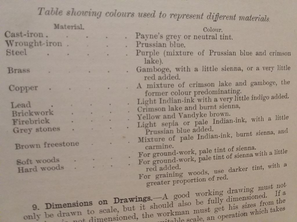
                                  I have a wonderful old book, A Manual of Machine Drawing and Design, published in 1899, It includes the following (as well as how to make your best best black ink by rubbing a block of Indian Ink powder in water etc.

                                  20221031_194845.jpg

                                  The authors are one David Allan Low and one Alfred William Bevis, both of whom proudly include Whitworth Scholar after their names on the title page. Apparently old Sir Joseph W set up the scholarship so ex-apprentices could go to university to complete an engineering degree. Proper engineers they were then.

                                  In the front of my copy of the book there is a certjficate glued in saying it was presented on behalf of the G.E.R. Mechanics Institution as a Prize Award to one WH Smith. (No not that WH Smith, he were dead by then) by a Miss Audrey Makins at Town Hall, Stratford, E. on December 5th 1900. No idea who WH was. Possibly an apprentice who topped his exams or some such?

                                  A little bit of history anyway. Nice to feel I am in such good company when reading it. It contains all you needed to know in 1900 about designing and drawing steam engines and boilers. I bought it for the lovely drawings in the back of a triple expansion engine, with dreams of building one. But decided I would need another lifetime to get all these projects done. Have enquired with the authorities upstairs about such a proposition, but so far no reply!

                                  #619245
                                  Nick Clarke 3
                                  Participant
                                    @nickclarke3
                                    Posted by Michael Gilligan on 30/10/2022 22:20:54:

                                    ”A Manual of Photography in Colours” … published 1900

                                    [which, whilst a considerable digression, might possibly be of interest to some readers]

                                    MichaelG.

                                    A few years back I lectured to a number of different photographic collecting societies on the history of photographic processes so it is certainly of interest!

                                    What few may realise is that all full colour reproduction processes ever used are based on the principle of the combination of two or more coloured monochrome images. This includes colour printing, colour computer printing, colour TV (inc computer screens and monitors) and both film (silver based) and digital photography.

                                    The only exception to this I am aware of is the Lippmann process which while expensive, dangerous and impractical today due to the mercury involved does record light of different wavelengths directly.

                                    #619246
                                    Anonymous
                                      Posted by JasonB on 30/10/2022 20:41:26:
                                      …nicely coloured elevations of an engine that his father (or grandfather) did.

                                      It was drawn by my grandfather in indian ink and watercolour wash, dated March 1908. He was chief draughtsman at Westland Aircraft in Yeovil from 1925 to 1939, when he moved to Airspeed, also as chief draughtsman. At Airspeed he knew Neville Shute Norway very well.

                                      Andrew

                                      #619250
                                      Michael Gilligan
                                      Participant
                                        @michaelgilligan61133
                                        Posted by Neil Wyatt on 31/10/2022 10:09:35:

                                        The color gamboge …

                                        .

                                        … is also described here: **LINK**

                                        https://www.theawl.com/2017/11/gamboge-a-sunny-yellow-with-a-deadly-past/

                                        With a highly suspect ‘painted swatch’ dont know

                                        MichaelG.

                                        #619251
                                        SillyOldDuffer
                                        Moderator
                                          @sillyoldduffer

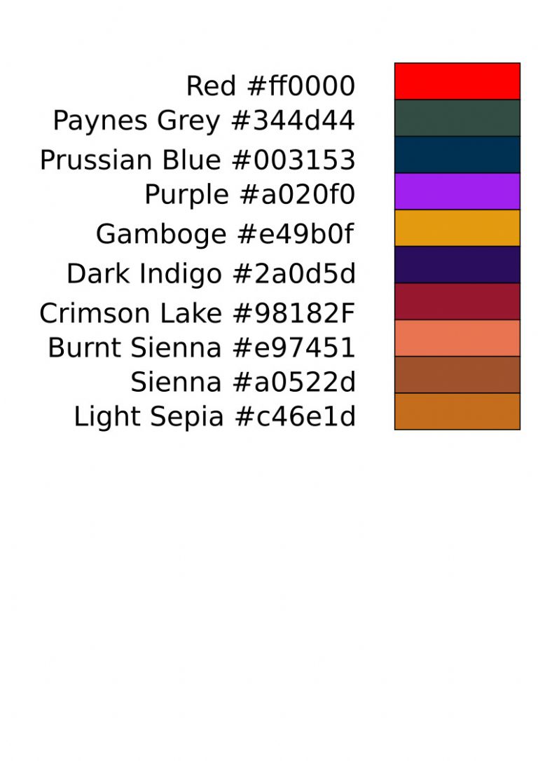
                                          A chart showing what the base colours look like and their hex values, but beware! They won't be visually correct unless the viewer's display device is colour calibrated.

                                          colorcodes.jpg

                                          The colour chart above presents slightly differently on the two screens I use for CAD.

                                          Another misleading factor is the colours are all fully saturated, which is rarely the case on drawings I've seen. Seems more usual for drawings to be coloured with a light wash rather than blocked out garishly.

                                          Colour coding is frowned upon in my Technical Drawing Books.

                                          • Not a good way of identifying materials . From the mid-19th century materials came in ever increasing variety so, apart from in Arrangement Drawings, it was necessary to specify which one by writing it down.
                                          • The human eye is not good at identifying shades of colour, and shades vary with lighting, age, and type of paper. The method is unreliable.
                                          • It's expensive!!!
                                          • Early copy processes, like Blueprints, were saturated monochome and demanded starkly contrasted drawings, typically black ink on white paper. They could do hatching, but not fields of colour.

                                          Always dangerous to generalise, but the main use of colour is Arrangement Drawings and for Public Relations. In arrangements, colour is as likely to identify features as materials – ship plans are often tinted to highlight things like machinery spaces.

                                          I'm against colour as a way of identifying materials in drawings. Mostly…

                                          Dave

                                          #619252
                                          Michael Gilligan
                                          Participant
                                            @michaelgilligan61133
                                            Posted by Hopper on 31/10/2022 10:20:43:

                                            I have a wonderful old book, A Manual of Machine Drawing and Design, published in 1899, It includes the following […]

                                            .

                                            Nice one, Hopper yes

                                            The ‘Recipe Book’ is slowly starting to take form

                                            I don’t know whether they will reply, but I wrote to one of the ‘Art Supplies’ dealers this morning, asking about matching modern colours to the 19th Century names … Could be interesting, or might be a dead-end

                                            MichaelG.

                                            #619253
                                            Michael Gilligan
                                            Participant
                                              @michaelgilligan61133
                                              Posted by SillyOldDuffer on 31/10/2022 11:25:26:

                                              […]

                                              Always dangerous to generalise, but the main use of colour is Arrangement Drawings and for Public Relations. In arrangements, colour is as likely to identify features as materials – ship plans are often tinted to highlight things like machinery spaces.

                                              I'm against colour as a way of identifying materials in drawings. Mostly…

                                              Dave

                                              .

                                              ”Arrangement Drawings” is exactly what I have in mind, Dave

                                              [ consider the Pultra headstock in Dell’s thread ]

                                              Edit: __ and perhaps also note the ‘Subject’ of this one

                                              MichaelG.

                                              Edited By Michael Gilligan on 31/10/2022 12:04:18

                                              #619255
                                              JasonB
                                              Moderator
                                                @jasonb

                                                having worked in an art suppliers for almost 20yrs (long saturday job) most of those colours are still available with the exception of a few who's pigments have been found to be toxic. There are also a few substitutes where cost or availability put some pigments out of reach. This is for proper artist's pigments with the natural rather than synthetic pigments of the cheaper hobby grade watercolour, same applies to oils.

                                                "Washes" were used and the dilution together with the resulting amount of white from the paper showing through was and still is the way the darkness of the colour is altered not by using a lighter colour and definately not by adding white.

                                                #619256
                                                Hopper
                                                Participant
                                                  @hopper

                                                  Maybe the coloured GA drawings, used for sales and promotion purposes, were the early equivalent of the PowerPoint presentation?

                                                  #619258
                                                  Nick Clarke 3
                                                  Participant
                                                    @nickclarke3
                                                    Posted by Hopper on 31/10/2022 12:29:58:

                                                    Maybe the coloured GA drawings, used for sales and promotion purposes, were the early equivalent of the PowerPoint presentation?

                                                    And at least in those days one would have been spared bits of a slide twirling in from the sides in an incomprehensible manner!

                                                    #619293
                                                    Dr_GMJN
                                                    Participant
                                                      @dr_gmjn

                                                      Slightly different subject I guess, but I did a course at work on engineering drawings to BS8888 a few years back. The person running the course has been involved in compiling and updating the relevant standards. He’d asked for examples of our drawings to critique, and a couple of mine were sent.

                                                      In CAD I always drew my outlines in green or cyan, and the dimension lines etc. in red. Sometimes these were printed in black with different line weights, but sometimes I printed them in colour. I just found them far easier to read when I knew at a glance that the green was the part. Might sound obvious, but with a complex drawing with lots of leader lines, hatching and centrelines, the part outline or section often doesn’t jump out at you; it sometimes takes some looking at.

                                                      The person running the course said he’d not come across drawings in colour before, and as far as he could remember there was nothing in the standard stating it wasn’t recommended, nor that there were standard colours if you chose to print them.

                                                    Viewing 25 posts - 1 through 25 (of 65 total)
                                                    • Please log in to reply to this topic. Registering is free and easy using the links on the menu at the top of this page.

                                                    Advert

                                                    Latest Replies

                                                    Home Forums General Questions Topics

                                                    Viewing 25 topics - 1 through 25 (of 25 total)
                                                    Viewing 25 topics - 1 through 25 (of 25 total)

                                                    View full reply list.

                                                    Advert

                                                    Newsletter Sign-up