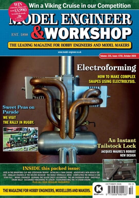

Readability / clarity in new combined magazine
Readability / clarity in new combined magazine
- This topic has 34 replies, 19 voices, and was last updated 7 July 2026 at 18:24 by
 JasonB.
 JasonB.
 SillyOldDuffer
 Trevor Gale
 Russell Eberhardt
 Howard Lewis
 alecs
alecs JasonB
 Bazyle
- Please log in to reply to this topic. Registering is free and easy using the links on the menu at the top of this page.
Latest Replies
-
- Topic
- Voices
- Last Post
-
-
Clutch for ML7R
Started by:
Andrew Tinsley
in: Manual machine tools
- 7
-
12 October 2026 at 06:48
Dave Wootton
-
The lazy man’s fly cutter
Started by:
Sonic Escape
in: Workshop Tools and Tooling
- 11
-
12 October 2026 at 02:23
Pete
-
Farm Gate Lock.
Started by:
Grizzly bear
in: The Tea Room
- 4
-
12 October 2026 at 01:07
Speedy Builder5
-
What Did You Do Today 2026
1
2
…
8
9
Started by:
JasonB
in: The Tea Room
- 54
-
11 October 2026 at 23:25
Nigel Graham 2
-
New Member
Started by:
starjump
in: Introduce Yourself – New members start here!
- 4
-
11 October 2026 at 23:22
starjump
-
Reverting An ML7 To Change-Wheels: Any Thoughts??
1
2
3
Started by:
Nigel Graham 2
in: Manual machine tools
- 21
-
11 October 2026 at 23:19
Nigel Graham 2
-
Best approach to pip removal
Started by:
Bill Phinn
in: Workshop Techniques
- 10
-
11 October 2026 at 22:35
Nigel Graham 2
-
3 1/2” gauge loco, coupling height?
Started by:
Paul McDonough
in: Locomotives
- 5
-
11 October 2026 at 22:14
Paul McDonough
-
Liney RV-2 Rescue
Started by:
JasonB
in: Stationary engines
- 3
-
11 October 2026 at 21:43
renardiere7
-
Preview of whats coming in Freecad 26.3
1
2
Started by:
Russell Eberhardt
in: CAD – Technical drawing & design
- 8
-
11 October 2026 at 20:36
lee webster
-
Motorcycle Centre Stand Pivot
Started by:
COLIN MARTIN 2
in: Related Hobbies including Vehicle Restoration
- 8
-
11 October 2026 at 20:00
peak4
-
Powerfeeders
Started by:
larry phelan 1
in: Help and Assistance! (Offered or Wanted)
- 4
-
11 October 2026 at 19:10
old mart
-
Moving Targets
Started by:
Michael Gilligan
in: The Tea Room
- 10
-
11 October 2026 at 18:01
Howard Lewis
-
Myford ML4 Identification
Started by:
Steven Volz
in: Manual machine tools
- 7
-
11 October 2026 at 17:08
Howard Lewis
-
Workshop building – have lots of space
Started by:
Carl Farrington
in: General Questions
- 1
-
11 October 2026 at 16:51
Carl Farrington
-
Hello from Pensford
Started by:
ralpharama
in: Introduce Yourself – New members start here!
- 3
-
11 October 2026 at 16:08
Howard Lewis
-
Too much to take in in one go, FreeCAD 26.3
Started by:
Russell Eberhardt
in: CAD – Technical drawing & design
- 1
-
11 October 2026 at 15:47
Russell Eberhardt
-
Stuart Twin Victoria (Princess Royal) Mill Engine
1
2
…
51
52
Started by:
Dr_GMJN
in: Work In Progress and completed items
- 34
-
11 October 2026 at 13:26
Zan
-
Lathe turning tool nomenclature
Started by:
JA
in: Workshop Tools and Tooling
- 8
-
11 October 2026 at 11:20
JohnF
-
Painting stainless steel
Started by:
Colin Teasdale
in: General Questions
- 7
-
11 October 2026 at 08:20
Hollowpoint
-
Little ’36 Midget Build
1
2
Started by:
JasonB
in: I/C Engines
- 6
-
10 October 2026 at 19:33
GrahamS
-
Model Turbines
1
2
…
26
27
Started by:
Turbine Guy
in: Stationary engines
- 28
-
10 October 2026 at 19:16
Turbine Guy
-
Locomotion No 1 – plans
Started by:
Bob Wild
in: Help and Assistance! (Offered or Wanted)
- 6
-
10 October 2026 at 14:55
Michael Gilligan
-
My adventures with a bench top CNC mill
1
2
3
4
Started by:
John Hinkley
in: CNC machines, Home builds, Conversions, ELS, automation, software, etc tools
- 9
-
10 October 2026 at 14:43
John Hinkley
-
Dore Boring Bar set
Started by:
Andrew Tinsley
in: General Questions
- 8
-
10 October 2026 at 13:53
Charles Lamont
-
Clutch for ML7R
 Andrew Tinsley
  Dave Wootton
 Sonic Escape
  Pete
Pete Grizzly bear
  Speedy Builder5
 Nigel Graham 2
 starjump
  Bill Phinn
  Paul McDonough
  renardiere7
 Russell Eberhardt
  lee webster
 COLIN MARTIN 2
  peak4
peak4 larry phelan 1
  old mart
 Michael Gilligan
  Howard Lewis
 Steven Volz
  Carl Farrington
  ralpharama
  Dr_GMJN
  Zan
Zan JA
JA  JohnF
JohnF Colin Teasdale
  Hollowpoint
 GrahamS
 Turbine Guy
  Bob Wild
  John Hinkley
  Charles Lamont