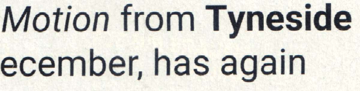
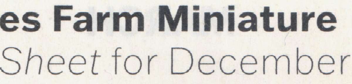
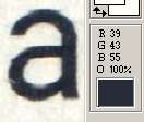
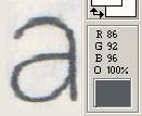
Readability / clarity in new combined magazine
Readability / clarity in new combined magazine
- This topic has 26 replies, 17 voices, and was last updated 28 June 2025 at 15:36 by
 Trevor Gale.
- Please log in to reply to this topic. Registering is free and easy using the links on the menu at the top of this page.
Latest Replies
-
- Topic
- Voices
- Last Post
-
-
High strength 4mm steel?
Started by:
iansoady
in: Materials
- 13
-
28 June 2025 at 20:25
duncan webster 1
-
New member looking for help
Started by:
manfromthemist
in: Introduce Yourself – New members start here!
- 9
-
28 June 2025 at 20:10
manfromthemist
-
Sanjay’s Banjo Engine
Started by:
JasonB
in: Stationary engines
- 1
-
28 June 2025 at 20:06
JasonB
-
TurboCAD Snaps and Dimensioning?
1
2
Started by:
Nigel Graham 2
in: CAD – Technical drawing & design
- 8
-
28 June 2025 at 18:30
Nigel Graham 2
-
All things Beaver Mill
1
2
…
8
9
Started by:
Robert James 3
in: Manual machine tools
- 41
-
28 June 2025 at 17:06
DC31k
-
Readability / clarity in new combined magazine
1
2
Started by:
Trevor Gale
in: Model Engineer & Workshop
- 17
-
28 June 2025 at 15:36
Trevor Gale
-
Offen screw type telescopic gauge.
Started by:
Graeme Seed
in: Workshop Tools and Tooling
- 3
-
28 June 2025 at 14:11
bernard towers
-
New (old!) member
Started by:
iansoady
in: Introduce Yourself – New members start here!
- 2
-
28 June 2025 at 13:44
noel shelley
-
Amadeal AMABL210E Review – Any Requests?
1
2
Started by:
JasonB
in: Model Engineer & Workshop
- 15
-
28 June 2025 at 13:18
JasonB
-
My experiences with an ELS lathe
Started by:
David Senior
in: CNC machines, Home builds, Conversions, ELS, automation, software, etc tools
- 9
-
28 June 2025 at 12:40
John Haine
-
Meddings MF4 Manual
Started by:
Richard Kirkman 1
in: Help and Assistance! (Offered or Wanted)
- 9
-
28 June 2025 at 11:14
DC31k
-
road registration and traction trailer.
Started by:
RRMBK
in: Traction engines
- 6
-
28 June 2025 at 11:06
Dave Halford
-
Martin Evans ‘SIMPLEX’ boiler bush thread form?
Started by:
Keith Charters
in: Locomotives
- 4
-
27 June 2025 at 22:40
Charles Lamont
-
Boolean bewilderment
Started by:
Michael Gilligan
in: The Tea Room
- 8
-
27 June 2025 at 19:07
Michael Gilligan
-
Dial test indicator vs Dial indicator
Started by:
martian
in: Workshop Tools and Tooling
- 13
-
27 June 2025 at 18:49
Diogenes
-
2 Machine lights
Started by:
modeng2000
in: Workshop Tools and Tooling
- 1
-
27 June 2025 at 11:57
modeng2000
-
Maisie lubricator
Started by:
ferroequinologist
in: Locomotives
- 8
-
27 June 2025 at 11:02
Derek Drover
-
Pulley taper – Herbert B drill
Started by:
gerry madden
in: Manual machine tools
- 8
-
27 June 2025 at 10:36
SillyOldDuffer
-
TuffSaws?
Started by:
Bo’sun
in: Workshop Tools and Tooling
- 3
-
27 June 2025 at 09:09
IanT
-
Iron ore reduction
Started by:
duncan webster 1
in: The Tea Room
- 6
-
27 June 2025 at 09:05
Bo’sun
-
What Did You Do Today 2025
1
2
…
6
7
Started by:
JasonB
in: The Tea Room
- 32
-
27 June 2025 at 08:26
bernard towers
-
Is Green Hammerite really so ‘infra dig ‘ ?
Started by:
Michael Gilligan
in: The Tea Room
- 9
-
27 June 2025 at 07:00
Howard Lewis
-
Vee micrometer
Started by:
Graeme Seed
in: Workshop Tools and Tooling
- 9
-
26 June 2025 at 19:24
Graeme Seed
-
Octopus … Is there method in this madness ?
1
2
Started by:
Michael Gilligan
in: The Tea Room
- 19
-
26 June 2025 at 18:30
not done it yet
-
3″ Burrell build
Started by:
Deric
in: Traction engines
- 8
-
26 June 2025 at 18:20
RRMBK
-
High strength 4mm steel?
Latest Issue
Newsletter Sign-up
Latest Replies
- High strength 4mm steel?
- New member looking for help
- Sanjay’s Banjo Engine
- TurboCAD Snaps and Dimensioning?
- All things Beaver Mill
- Readability / clarity in new combined magazine
- Offen screw type telescopic gauge.
- New (old!) member
- Amadeal AMABL210E Review – Any Requests?
- My experiences with an ELS lathe

