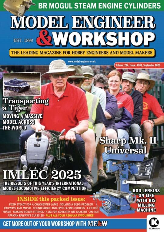
Readability / clarity in new combined magazine

Advert

Readability / clarity in new combined magazine

Home Forums Model Engineer & Workshop Readability / clarity in new combined magazine

Viewing 20 posts - 1 through 20 (of 20 total)
  • Author
    Posts
  • #788147
    Trevor Gale
    Participant
      @trevorgale

      I received the new combined issue nr.1 of Model Engineer & Workshop – and found some changes were alas not so helpful. The content is just fine, I have no issues with that.

      The main problem I encountered was with the clarity / readability of some articles. Especially the “club news” by Geoff Theasby, and the series on Stationary Steam Engines were previously printed in black (and nearly ‘bold’) font – whilst in the new combined issue these were printed using the same font size but in grey (less contrast) and with less-than-normal character thickness.

      Is this a known / expressly-chosen change, or has it occurred due to an oversight? Also, have any other readers encountered this issue?

      I’m no teenager, but at 70 I have really good eyesight and still work with small surface-mount microwave electronic devices in one of my other pursuits.

      Advert
      #788168
      Nicholas Farr
      Participant
        @nicholasfarr14254

        High Trevor Gale, yes, it has been spoken about. New Look

        Regards Nick.

        #788186
        Nigel Graham 2
        Participant
          @nigelgraham2

          I found the Stationary Steam Engine instalment spoilt by the drawing having been reproduced too small for legibility.

          #788191
          Bazyle
          Participant
            @bazyle

            Look again at the Stationary Engine article. I think it was made low contrast so parts of it could be emphasised in bold.

            #788237
            SillyOldDuffer
            Moderator
              @sillyoldduffer

              Judging by differing reports on this issue, I think some magazines were misprinted. My copy has several faded sections.  Technical problem I suspect, not an editorial decision.

              I’m waiting for the next one!

              Dave


              #788271
              Clive Foster
              Participant
                @clivefoster55965

                I suspect I’m not the only one among the, ahem, “more mature” members of our community who wishes the fashion for narrow stroke sans serif fonts would disappear back down the hole from hell it came from.

                If I ever run into the guy or gal who decided it was a good idea to make lower case L and number 1 identical their vocabulary is going to be seriously expanded. And not in a good way!

                The serifs on “old fashioned” fonts like Times are there for a reason. Times in particular was designed for readability. An important issue in the days when effective, accurate, vision correcting spectacles were not readily and affordably available so the needs of folk struggling with less than perfect or inadequately corrected vision were important.

                Helvetica and its multitudinous relations are display fonts to be seen at a distance, not reading text fonts. Serifs are wrong for that sort of application. There superb Motorway and Transport fonts used on British road signs show how to do that job.

                Clive

                #788313
                Trevor Gale
                Participant
                  @trevorgale

                  It’s not the sans serif font which I call into question – and in any case as far as I see the actual font and font size is the same “before and after” as it were – it is the question of the font being printed ‘bold’ or not, although I think that the ‘thin’ font printed in this new issue is actually regular; whichever is the case, it is the fact that the type seems to be printed in grey rather than in black.

                  #788327
                  bernard towers
                  Participant
                    @bernardtowers37738

                    or is possibly the density of the print?

                    #788376
                    Trevor Gale
                    Participant
                      @trevorgale

                      Maybe the issue with readability here is the text character density or maybe the actual colour; in my first look I thought the font size was the same – it is not, as I discovered today, as in the old ME magazine (for “Club News” at least), 20 lines of normal text occupies +/- 77mm vertical whilst similar text from “Club News” in the new ME&W, 20 lines of normal text occupies +/- 73mm vertical. Line spacing may also be slightly less but I have not measured this.

                      I have taken a couple of scans from both magazines to look at text character comparisons which I include here – everything is taken at the same scale, all from “Club News”: the 1st image is from the ‘old’ ME, with both normal, italic and bold text; the 2nd image is from the ‘new’ ME&W.

                      Following those, I made a colour comparison using a graphics package: here, the colours red, green and blue each have a value of 0 … 255 where 0 = black and 255 = full colour. If all 3 colours from a point in an image have values below 40, it will appear as near-black. If they are all at values above 90 but below 160 it can be considered grey, much higher and it can be considered approaching white.

                      The 3rd image is a normal-text character “a” from the ‘old’ ME, showing colour values just above an expected ‘black’; the 4th image is again a normal-text character “a” but from the ‘new’ ME&W, there is a significantly lighter colour for this character. I am just hoping that the next and following issues of ME&W are printed in a more readable state.oldseg1newseg1oldcolor2newcolor2

                      #788386
                      Clive Foster
                      Participant
                        @clivefoster55965

                        For equal legibility a thin stroke font requires higher acutance than a thick stroke one. For practical purposes more contrast, as in hard black against hard white compared to very dark grey on not quite white.

                        Acutance describes the steep ness of teh black-white transition rather than the absolute difference so it’s not quite the same as contrast. The various effects on visual processing and how hard the eyes have to work when reading are complex.

                        For ageing eyes thin stroke fonts are more tiring to read. The lower the acutance the more tiring it becomes.

                        A font with curvy joints between strokes and serifs tends to be less tiring due to having more visual cues as to what each letter is.

                        Clive

                        #790284
                        Michael Henders
                        Participant
                          @michaelhenders63105

                          I’m receiving the magazine in digital format; I’m going to assume that bypasses any production issues that involve the actual printing process.

                          The first thing that I’ve noticed is that the page numbers in the new format are horrible.  Comparing Issue #4763 side by side with #4761 on my laptop screen, they’re less than 2/3 the original height.  That, combined with a very ‘thin’, grey font, makes them essentially illegible without a lot of zooming-in.  The table of contents page is also using a thinner, de-contrasted font, making it harder to read.

                          Beyond that, there’s variability.  A lot of the general article text seems to be in the same font as previously, but “Smoke Rings” is definitely ‘lighter’, and the font weight actually changes on page 14, starting light then reverting to the original, heavier font, on the last line of column 1.  I don’t know what to make of that, exactly, but I have to think it’s a glitch in the formatting of the original article.

                          Anyway, I’m really hoping for a reversion to the original font weight/colour/size, especially for those page numbers!

                          Mike

                          #790308
                          Charles Lamont
                          Participant
                            @charleslamont71117

                            There is definitely still something odd about the typesetting in the paper version.

                            All article text, apart from some sidebars, seems to be set at about 10.5 points line spacing, but there is variation in font size and weight, presumably to neatly fit the page.

                            For example, Ron Fitzgerald’s piece, on pp 52 & 53, is in a considerably smaller font than other articles.

                            Milling in the Lathe on pp 9-13 is set consistently in a weight and size that I would say is ideal.

                            On page 14 in Meet the Editor there is a difference within one page. The first column is set in a lighter weight than the second and third columns, except for the last line which is in the heavier weight. The thicker strokes can easily be seen with a magnifying glass comparing those last two lines.

                            Does a tiny adjustment in font size result is a step change in weight?

                            As an older reader, as probably most of us are, I would prefer to see the heavier weight used consistently throughout, rather than condensing or lightening the font to cram every last corner of the page (if that is what is happening). This might mean slightly less content, a bit of white space here and there, and perhaps some split pages to tidy up loose ends. A consistent size and weight would also be aesthetically more satisfactory.

                            #790358
                            Trevor Gale
                            Participant
                              @trevorgale

                              Charles, I would be interested to know which issue you are referring to since my front cover mentions ‘issue: 4762’ – in which Ron Fitzgerald’s article on the stationary steam engine is on pp.44 and pp.45, but is in a smaller font than others.

                              Where I have a difference on one page is in the “Postbag” section on both pp.42 and pp.43, – indeed on pp.43 I see 3 different sizes and spacings in the 4 letters, and immediately under the 4th letter (‘Thread Pitch Problem’) there is a reply from our good Editor which is in a smaller font again!

                              If you are referring to a newer issue (presumably the second in the new format) which I have not yet received, then it would seem that nothing has been changed since the first one.

                              I must state that I am not trying to be finicky concerning this matter, but I would expect my favourite journal to be more legible, as the earlier ones both were.

                              #790362
                              Charles Lamont
                              Participant
                                @charleslamont71117

                                I should have said: 4763.

                                #790366
                                Oldiron
                                Participant
                                  @oldiron

                                  I find that most  “colour on colour” pieces of text almost impossible to read easily.   I mostly skip articles thus printed.

                                  #790373
                                  Trevor Gale
                                  Participant
                                    @trevorgale

                                    This “colour on colour” problem is quite common amongst both printed media and video screen formats: it is often due to the age-old problem of people not recognising the difference between colour addition (video) and colour subtraction (print) before they issue whatever content that they wish to produce.

                                    In colour addition, the primary colours are red, green and blue. In colour subtraction, the primary colours are magenta, cyan and yellow.

                                    Some combinations work very well when viewed on a computer screen (addition) but are of no use when replicated in print.

                                    #790389
                                    Graham Meek
                                    Participant
                                      @grahammeek88282

                                      I was not going to renew my subscription but decided to change my mind. My re-subscription started with the second issue. While I found myself picking the magazine up to read more than I did the Workshop edition. There is one thing that really bugs me and that is the text on the photographs. This may be the modern way, but to me it takes away some of the photograph and I find the “White” characters used on some photographs “Tacky”.

                                      The old number system works for me.

                                      I do hope however that there is no decision to change from “White” to “Red”, as some of us cannot see this colour especially if it is printed on a photograph.

                                      Regards

                                      Gray,

                                      #790895
                                      Trevor Gale
                                      Participant
                                        @trevorgale

                                        Having received issue no. 4763 I must say that things appear to be improved.

                                        The ‘Club News’ pages are once again as nicely legible as they used to be, seemingly identical to the old M.E. format. Readers’ letters (“Postbag”) also looks good with a more consistent text font & darker print, though I see 2 fonts there.

                                        I haven’t read every article yet but generally it is more legible – to do this in a short time (one issue) is great work!

                                        The “Stationary Steam Engine” serial article is still printed in the small font however – is this because it was already at the printing / layout stage? This is the remaining issue that I see, along with the microscopic page numbers! Also, even searching through all the pages, I could not find the “Quick notes from the Workshop” article anywhere (it’s listed in the ‘Contents’ page as pp.39 which is actually occupied by the “Working on the Lathe” article.

                                        In any case, praise be where praise is due and I look forward to the further improvements.

                                        #790899
                                        JasonB
                                        Moderator
                                          @jasonb

                                          Speaking with Neil last night the page numbers are due to be improved.

                                          #790904
                                          John Haine
                                          Participant
                                            @johnhaine32865

                                            Given the capability of modern page makeup tools I can’t understand why the normal text typeface varies even between successive paragraphs in places. Section titles are rather intrusive. In places figure numbering is all over the shop. Generally the page layout looks old fashioned and dark. I only occasionally read the mags online through Libby and I don’t think my visits will be any more frequent now.

                                          Viewing 20 posts - 1 through 20 (of 20 total)
                                          • Please log in to reply to this topic. Registering is free and easy using the links on the menu at the top of this page.

                                          Advert

                                          Latest Replies

                                          Viewing 25 topics - 1 through 25 (of 25 total)
                                          Viewing 25 topics - 1 through 25 (of 25 total)

                                          View full reply list.

                                          Advert

                                          Newsletter Sign-up