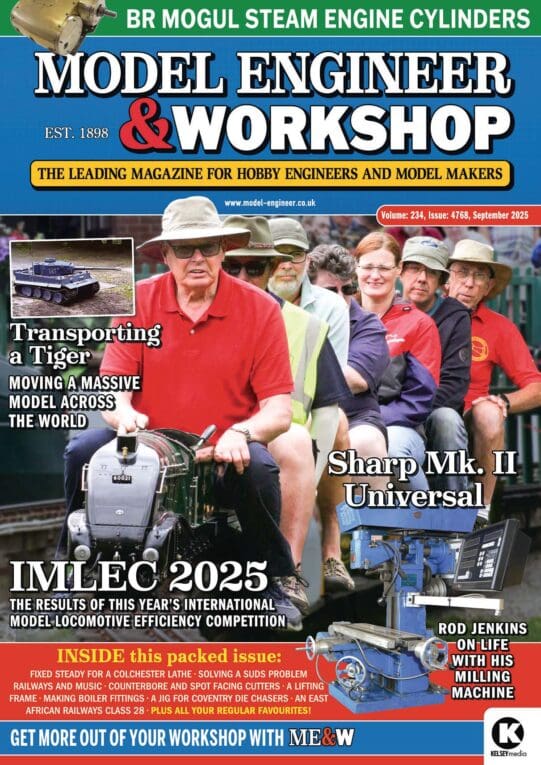
Readability / clarity in new combined magazine
Readability / clarity in new combined magazine
- This topic has 27 replies, 18 voices, and was last updated 7 July 2025 at 15:53 by
 Russell Eberhardt.
- Please log in to reply to this topic. Registering is free and easy using the links on the menu at the top of this page.
Latest Replies
Viewing 25 topics - 1 through 25 (of 25 total)
-
- Topic
- Voices
- Last Post
Viewing 25 topics - 1 through 25 (of 25 total)
Latest Issue
Newsletter Sign-up
Latest Replies
- Swing over bed limitation for flywheels
- Drunk driver broke my workshop!
- No more Google
- What Did You Do Today 2025
- Looking for book on basic strengthening and design methods for steel structures
- An Unexpected Message
- Looking for a quality pencil sharpener
- Exeter & District Model Engineers Show – 7 Sept
- Mysterious inserts
- Dead Centres?


