Hieroglyphics on a Wehlen & Co clock face

Advert

Hieroglyphics on a Wehlen & Co clock face

Home Forums Clocks and Scientific Instruments Hieroglyphics on a Wehlen & Co clock face

Viewing 25 posts - 26 through 50 (of 60 total)
  • Author
    Posts
  • #423848
    Michael Gilligan
    Participant
      @michaelgilligan61133

      Posted by SillyOldDuffer on 11/08/2019 11:14:22:

      … Daffy Duck etched in miniature on an Integrated Circuit indeed!

      .

      This version of the Silicon Zoo seems to be working: **LINK**

      https://micro.magnet.fsu.edu/creatures/

      [sorry, Sam … no progress on the dial glyphs]

      MichaelG.

      Advert
      #423850
      Sam Stones
      Participant
        @samstones42903

        Like a clock pendulum, the dialogue has swung back and forth.

        With little to add other than my appreciation for all the interest and direction, I decided to move on to (SOD) Dave’s comments about the method used to apply the Roman (Latin?) numerals. There was a possibility too that the outcome may prove useful to modellers who are keen to embellish their work with a high level of realism.

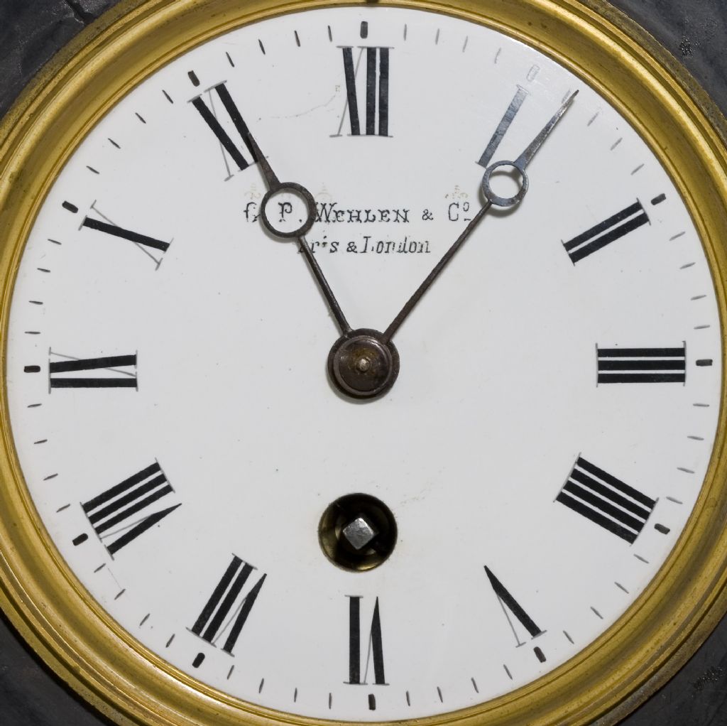
        Here's my latest clock face …

        crw_7392 - whole dial.jpg

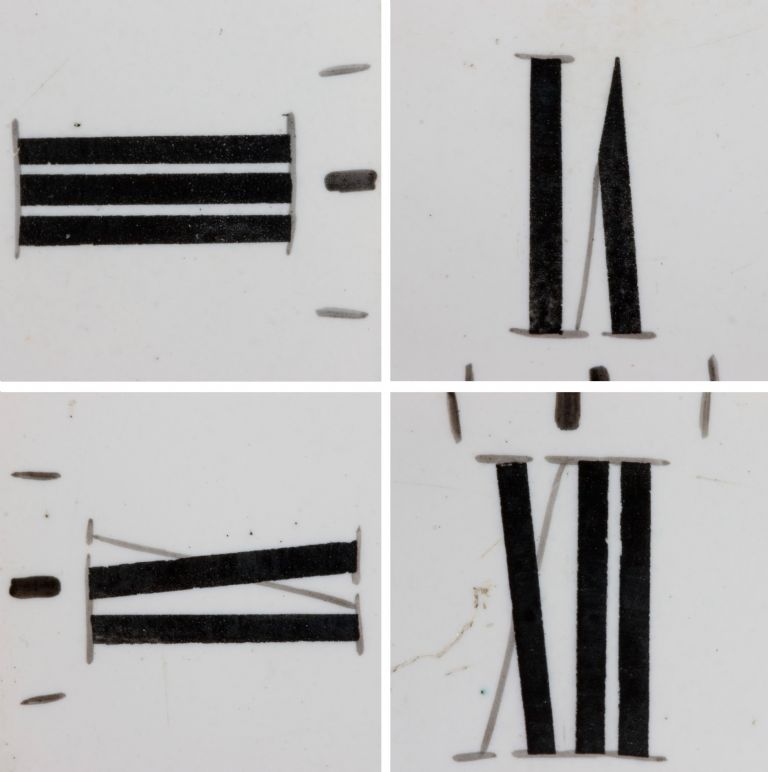
        And a composite of four numerals …

        numeral-composite---03.jpg

        Here are some extra details …

        Detectable by touch and from my earlier (flash illuminated) picture, the characters appear to have been painted. For scaling purposes, the numerals are 7/16" (11mm) in height.

        1. The black lines vary in width.
        2. Spacing’s between some black lines vary.
        3. The pointed ends of the V’s come close to a sharp point.
        4. The ends of black lines (X’s in particular) are at an angle, not perpendicular.
        5. The edges of some black lines are irregular.
        6. There is no real evidence of rubber stamp usage.
        7. The thin faint strokes around the face have the appearance of brush strokes.

        What method(s) did they use?

        Sam

        Re Silicon Zoo – I’m looking forward to the exploration Michael. It look fabulous.

        #423875
        John McNamara
        Participant
          @johnmcnamara74883

          Hi Sam

          I know that modern watch faces are often Pad printed. (As well as billions of bottles and the like) It works well on curved surfaces.

          I also read somewhere that this process goes back 100 years?

          I wonder if the raised text might have been done by this process or a similar process.

          Here is a Search that revealed a few good links……
          **LINK**

          Regards
          John

          #423883
          Nigel Graham 2
          Participant
            @nigelgraham2

            I'm as intrigued as everyone else on the real meaning of those symbols, which I wonder may be visible by some accident of manufacture or aging rather than intent, but "Pad" printing?

            That's a new one on me – I understand offset-lithography and screen-printing, and of course the inked-stamp form going back to William Caxton; but had not heard of that, so thank you for that link.

            Screen Printing goes back to antiquity as an art form but its modern industrial version is used on anything from simple labels and dials to the very high accuracy and precision requires in mass-producing printed-circuit boards.

            #423886
            Michael Gilligan
            Participant
              @michaelgilligan61133
              Posted by Sam Stones on 13/08/2019 03:01:36:
              [ … ]
              What method(s) did they use?.

              .

              I have failed to find a decent illustration, Sam … but my understanding is that they used a rotating table with various angular divisions, and a linear guide-bar to steady the hand [and to facilitate drawing circles].

              … Think of some hybrid between an Animator's desk and a Sign-Writer's Mahl Stick.

              … or, indeed, a Rotary Table on your Milling Machine.

              Then it's 'just' a matter of using pens & brushes, with nerves of steel. surprise

              MichaelG.

              #423887
              Michael Gilligan
              Participant
                @michaelgilligan61133
                Posted by Nigel Graham 2 on 13/08/2019 10:10:02:

                … those symbols, which I wonder may be visible by some accident of manufacture or aging rather than intent,

                .

                That's my belief, Nigel

                MichaelG.

                #423889
                Michael Gilligan
                Participant
                  @michaelgilligan61133

                  Posted by Nigel Graham 2 on 13/08/2019 10:10:02:

                  "Pad" printing?

                  That's a new one on me –

                  .

                  Then you will probably enjoy this: **LINK**

                  MichaelG.

                  #423956
                  Nick Clarke 3
                  Participant
                    @nickclarke3
                    Posted by Michael Gilligan on 13/08/2019 10:20:51:

                    Posted by Sam Stones on 13/08/2019 03:01:36:
                    [ … ]
                    What method(s) did they use?.

                    .

                    I have failed to find a decent illustration, Sam … but my understanding is that they used a rotating table with various angular divisions, and a linear guide-bar to steady the hand [and to facilitate drawing circles].

                    … Think of some hybrid between an Animator's desk and a Sign-Writer's Mahl Stick.

                    … or, indeed, a Rotary Table on your Milling Machine.

                    Then it's 'just' a matter of using pens & brushes, with nerves of steel. surprise

                    MichaelG.

                    In a different context, bit have a look at this hand lining. **LINK**

                    #423967
                    stephen goodbody
                    Participant
                      @stephengoodbody77352

                      I'm inclined to agree with Michael – I suspect that they're a form of symbolic shorthand used by the clock's manufacturer to define what should be written where (what letters, truncation, case, location and spacing). Speculating further, this may have been to allow the dials to be farmed out to piecework sign-writers. Speculating even further, the sign-writers may also possibly have had little knowledge of English.

                      Each symbol seems to be associated with a specific section of the text, hence "Fr.", "P.", "Whelan" and "Co." each have their own symbol. Although not conclusive, I believe the wave symbol over the "Fr." may indicate a suspended term – a word which is truncated and replaced by a mark. The location of each symbol presumably indicates the desired placement of the word.

                      The symbol above the W in Whelan seems to indicate the desired width of the letter W in addition to its placement. Presumably nothing else in the word "Whelan" needed further explanation as they were presumably the employer or customer.

                      The three bars in each symbol seems to suggest the instruction that the first letter should be upper-case.

                      A quick Wikipedia search for Scribal Abbreviation seems to yield some possible additional clues.

                      Interesting stuff – good luck with the search!

                      Steve

                      Edited By stephen goodbody on 13/08/2019 16:38:11

                      #423981
                      Nick Clarke 3
                      Participant
                        @nickclarke3

                        I am still unconvinced by many of the suggestions here – not because they don't offer a reasonable meaning to the symbols, but rather to their logic and the practical side of putting them on there in the first place.

                        While I agree the G (not Fr), the P, the W and the Co in the top lines are all contractions for the full name of the company, Gustav Paul Wehlen and Company the marks appear from the close up on the first page of this post to have been painted onto the dial, along with the rest of the text and the markings. if it was to tell someone what to paint this would appear to be a very silly way of going about it as you would still need to tell the painter what to write.

                        Suggesting the maker said "I want you to put Captal G, full stop, Capital P, full stop, Wehlen with a capital W and the rest of the word in small caps then an ampersand the same height as the small caps then Co abbreviation for company with the o superscript and underlined. I have already painted some marks on the dial to show you the size and placing of the capital letters and abbreviations to help you" It is just not believable. The marks have not helped the painter much as regards letter width anyway!

                        Wouldn't it be easier to have just given the information on a piece of paper??

                        The company was based in Cullum Street in the City of London and in Paris where the same latin script was in use, with the possible exception of the W in France – so putting the dial out to a local outworker would suggest that he or she was familiar with the letter shapes required.

                        Were I wanting to tell someone how to paint this text I would want to tell them what script size and style to use, which is not easily identified from this – I think telling someone that the G was a capital and an abbreviation for a longer word is of no value if you are just being asked to paint G – and if you don't know how to do that you would need a drawing or a copy of the required text to follow not marks.

                        Edited By Nick Clarke 3 on 13/08/2019 17:48:00

                        #423983
                        Brian H
                        Participant
                          @brianh50089

                          I wonder if an approach to the BHI (British Horological Institute) would be useful. They are normally very helpful.

                          Brian

                          #423985
                          Brian G
                          Participant
                            @briang
                            Posted by Bill Phinn on 09/08/2019 02:26:37:

                            Is it possible it's just rubricated (and now somewhat faded) flourishing over the letters, i.e. solely decorative?

                            Could it be glue residue from gilding which has since been lost? I assume the decoration on the case is gilt.

                            Brian

                            #424010
                            Neil Wyatt
                            Moderator
                              @neilwyatt

                              I'm interested that the inner set of serifs for the numerals is curved, but the outer one is straight. This isn't an easy effect to achieve if using a built in font to generate them on a computer, although you can obviously draw the symbols from scratch like this.

                              Is this normal practice?

                              Neil

                              #424017
                              Michael Gilligan
                              Participant
                                @michaelgilligan61133
                                Posted by Neil Wyatt on 13/08/2019 20:44:33:

                                I'm interested that the inner set of serifs for the numerals is curved, but the outer one is straight.

                                .

                                'though not quite consistently

                                Have a look at theVI for example

                                I wonder: … is the variation by accident, or design ?

                                MichaelG.

                                #424046
                                Nick Clarke 3
                                Participant
                                  @nickclarke3
                                  Posted by Neil Wyatt on 13/08/2019 20:44:33:

                                  I'm interested that the inner set of serifs for the numerals is curved, but the outer one is straight. This isn't an easy effect to achieve if using a built in font to generate them on a computer, although you can obviously draw the symbols from scratch like this.

                                  Is this normal practice?

                                  Neil

                                  Or might that be an effect of the dial face being domed and not flat, or painted that way because the dial is in fact domed?

                                  #424082
                                  Andy Carruthers
                                  Participant
                                    @andycarruthers33275

                                    Is it possible the annotations are a combination of proofreader marks and manufacturer code?

                                    This site suggests the three horizontal strikes are for capitalizing: **LINK**

                                    #424117
                                    Nick Clarke 3
                                    Participant
                                      @nickclarke3
                                      Posted by Andy Carruthers on 14/08/2019 10:37:15:

                                      Is it possible the annotations are a combination of proofreader marks and manufacturer code?

                                      This site suggests the three horizontal strikes are for capitalizing: **LINK**

                                      Yes Three strokes underneath a draft text tell the compositor or printer to capitalise on the final printed page – but why put a mark including three strokes over, not under, a letter that is painted, not printed and then enamel them onto the dial alongside the final text? – You don't see proofreader's markups in a published book so why on a clock that presumably was sold to a customer.

                                      Just because the marks are the same shape as something else used in a completely different context does not imply they have the same meaning on a clock face, although as I have said before I am as much in the dark as anyone else and would be just as happy to be proved wrong if a definitive answer could be found.

                                      I am intrigued!!!!

                                      #424122
                                      Andy Carruthers
                                      Participant
                                        @andycarruthers33275

                                        Likewise I am intrigued – and agree it's a bit of a punt with regard to proofreader marks

                                        As for the lasting impression, it may be the markup paint reacted with the white base and over time "developed" despite the markup being removed after lettering was applied, I'm not a chemist…

                                        Happy to be proven wrong on all counts, simply offering some thoughts

                                        #424153
                                        Neil Wyatt
                                        Moderator
                                          @neilwyatt

                                          Maybe they are just decorative…

                                          #424240
                                          Michael Gilligan
                                          Participant
                                            @michaelgilligan61133

                                            Sam's question has prompted some thought, and interesting discussion … but there is surprisingly little information readily available about the technicalities of dial-making.

                                            These two articles by John Robey, although focusing on longcase dials, provide some background about the trade:

                                            **LINK**

                                            https://www.academia.edu/28200716/BIRMINGHAM_DIALMAKERS_SOME_BIOGRAPHICAL_NOTES_-PART_I

                                            **LINK**

                                            https://www.academia.edu/28478306/BIRMINGHAM_DIALMAKERS_SOME_BIOGRAPHICAL_NOTES_-PART_II

                                            MichaelG.

                                            #424394
                                            Sam Stones
                                            Participant
                                              @samstones42903

                                              John Robey’s biographical notes are an excellent source of historic information, Michael.

                                              I’m now exploring another direction which needs me to remove the clock's mechanism, and expose the false plate if there is one, and perhaps determine what material was used for the dial.

                                              Sam

                                              #424402
                                              Michael Gilligan
                                              Participant
                                                @michaelgilligan61133

                                                This [from Part I] might be the most relevant snippet:

                                                [quote]

                                                Whether Ann and James Osborne were also painters, like Thomas, or if they employed other artists is not known, but as the firm expanded it is likely that there were a number of workers. These would have prepared the dial sheets by applying multiple coats of base paint, painted the decoration, applied and gilded raised gesso work, while dial writers applied hour and minute numerals and other blackwork (the 'graphics', and, on moon dials, maps were printed on the hemisphere 'humps'. With so many operations necessary to produce a finished dial, and from the large number of surviving Osborne dials, it is clear that there was the potential for a significant workforce, but how many is unknown. Despite this, if the meagre evidence from later dialmakers is a guide, there were probably not as many workers as might be imagined.

                                                [/quote]

                                                [my emboldening]

                                                MichaelG.

                                                .

                                                Edit: Please excuse the intrusion of that stupid smiley thing !!

                                                Edited By Michael Gilligan on 15/08/2019 23:57:17

                                                #424625
                                                Sam Stones
                                                Participant
                                                  @samstones42903

                                                  I pondered whether to open a new thread about clock dials, but …

                                                  It had been suggested elsewhere that I investigate the clock for any other marks on the movement that could indicate who made the clock. While this is potentially heading away from identifying the ‘strange’ hieroglyphs, it opened another aspect – the dial itself.

                                                  What I was very reluctant to do was pull the clock apart and remove the dial. I ain't as steady as I used to be.

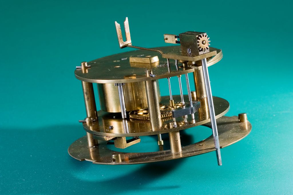
                                                  However, it turned out to be an opportunity to add a very tiny drop of clock oil to those pivots I chose to leave on a previous occasion. There was also a slight issue that the escapement wouldn’t work with the mechanism (and therefore the dial) truly vertical. Twisted a few degrees ACW and it would tick merrily. Otherwise, it would stop. The fault lay with either the crutch (and/or the fork) being out of line with the pendulum, see here …

                                                  **LINK**

                                                  and here …

                                                  crw_7413---wehlen---movement---top-view.jpg

                                                  With the mechanism back in place, judicious bending of the crutch arm restored most of the misalignment.

                                                  As for the dial itself, I found evidence of traditional enamelled copper methods used during its construction. A very shallow copper ‘dish’ retains the glazing powder during firing, similar to that seen in this video …

                                                  **LINK**

                                                  … and (presumably) provides better control of glaze thickness, especially at the edges.

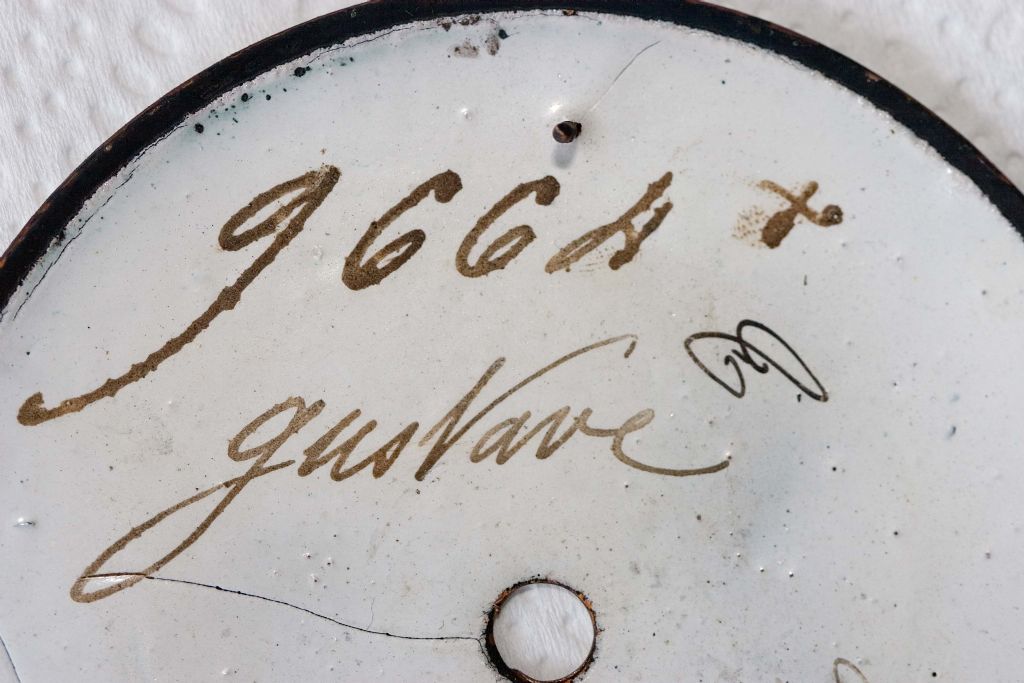
                                                  On the back was the number 9664. It’s the same number stamped on the back plate of the mechanism. Perhaps of greater interest was to find Gustave written on the back. Was it his writing or simply a means of identifying that the dial was for him?

                                                  crw_7398---wehlen---back-side-of-dial---gustave---9664.jpg

                                                  Several possibilities come to mind. What do you think?

                                                  Sam

                                                  PS – For a closer look, there are now three photo albums applicable to this thread and marked – Wehlen A, B, and C .


                                                  Edited By Sam Stones on 17/08/2019 00:26:42

                                                  #424628
                                                  Michael Gilligan
                                                  Participant
                                                    @michaelgilligan61133

                                                    Thanks for the 'reveal' Sam … yes

                                                    It seems we can treat the 'painted dial' trade an interesting diversion.

                                                    … I, for one, have been barking up the wrong tree.

                                                    MichaelG.

                                                    .

                                                    #424634
                                                    roy entwistle
                                                    Participant
                                                      @royentwistle24699

                                                      Sam The crutch arm should not have needed bending the collet should move on the arbor but if it works leave it

                                                      Roy

                                                    Viewing 25 posts - 26 through 50 (of 60 total)
                                                    • Please log in to reply to this topic. Registering is free and easy using the links on the menu at the top of this page.

                                                    Advert

                                                    Latest Replies

                                                    Viewing 25 topics - 1 through 25 (of 25 total)
                                                    Viewing 25 topics - 1 through 25 (of 25 total)

                                                    View full reply list.

                                                    Advert

                                                    Newsletter Sign-up