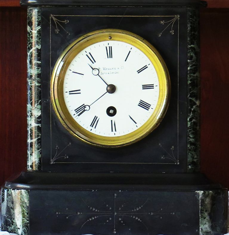
Hieroglyphics on a Wehlen & Co clock face

Advert

Hieroglyphics on a Wehlen & Co clock face

Home Forums Clocks and Scientific Instruments Hieroglyphics on a Wehlen & Co clock face

Viewing 25 posts - 1 through 25 (of 60 total)
  • Author
    Posts
  • #423212
    Sam Stones
    Participant
      @samstones42903

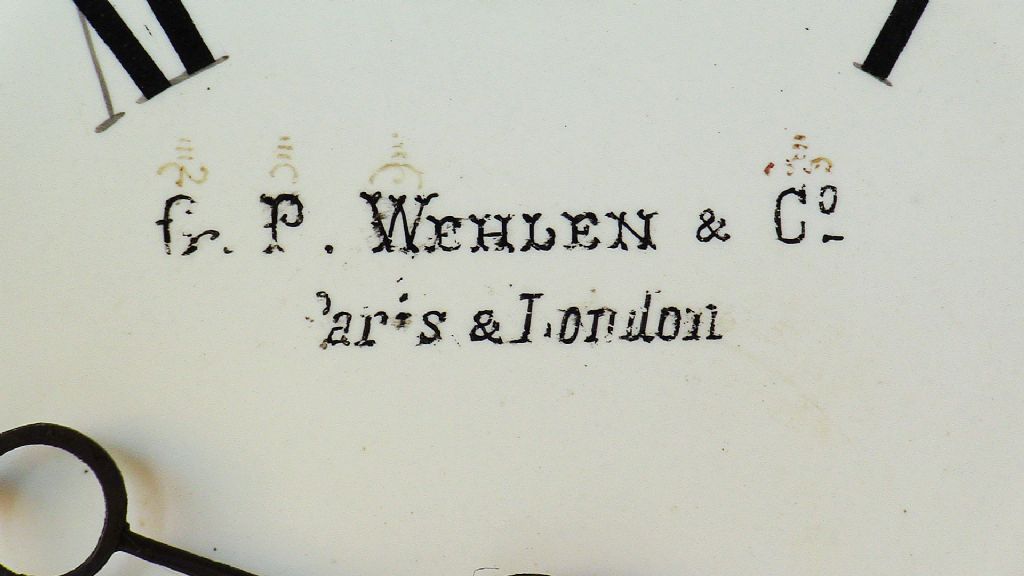
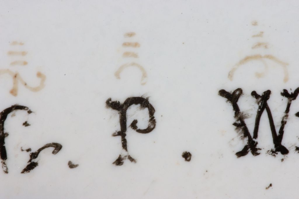
      I may have asked this before, but can anyone identify the faint markings about the name of this clock?

      Thanking you in anticipation.

      img_0377---wehlen-&-co.jpg

      img_0376---wehlen-&-co---ed.jpg

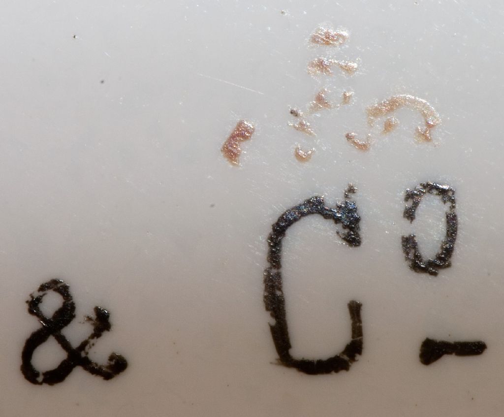
      img_0382---wehlen-&-co - ed.jpg

      img_0384---wehlen-&-co.jpg

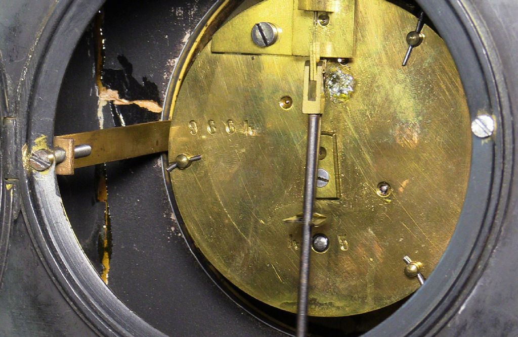
      By the way, that's not my soldering, although back in the 70's I did glue the marble case back together. Not as good a job as Kirsten or Steve of 'Repair Shop' might have done.

      Sam

      Advert
      #3849
      Sam Stones
      Participant
        @samstones42903

        Can anyone identify the markings?

        #423215
        Bill Phinn
        Participant
          @billphinn90025

          Is it possible it's just rubricated (and now somewhat faded) flourishing over the letters, i.e. solely decorative?

          #423219
          Michael Gilligan
          Participant
            @michaelgilligan61133
            Posted by Sam Stones on 09/08/2019 00:11:00:

            I may have asked this before, but can anyone identify the faint markings about the name of this clock?

            img_0382---wehlen-&-co - ed.jpg

            .

            . I thought it looked familiar, Sam …

            Just looked back through my eMails, and found that we discussed it in April 2017

            I failed you then, and thus far continue to do so blush

            MichaelG.

            #423234
            SillyOldDuffer
            Moderator
              @sillyoldduffer

              Just a suggestion, but might they have been put on by the dial painter to identify his work? Stone blocks in old ashlar walls often carry mysterious masons marks, partly for posterity, partly for payment, and this may be a feature of old clocks with hand made dials. (Did clockmakers make their own dials or buy them in from specialists?)

              The three horizontal lines above each character look decorative, but the symbols underneath may be Hebrew or Yiddish written sideways, possibly spelling out the painters initials.

              Fr P Wehlen implies to me the clock may be French, Fr being the abbreviation of Freres, ie Brothers. If the dial is continental the symbols may not be obvious to us Brits.

              Dave

              #423238
              Former Member
              Participant
                @formermember19781

                [This posting has been removed]

                #423241
                Brian H
                Participant
                  @brianh50089

                  Many clocks and watches were made for the Turkish market, could the marks be Turkish (although I don't know how you would find out).

                  Brian

                  #423259
                  Nick Thorpe
                  Participant
                    @nickthorpe64546

                    Deleted

                    Edited By Nick Thorpe on 09/08/2019 11:26:29

                    #423284
                    Brian H
                    Participant
                      @brianh50089
                      Posted by Brian H on 09/08/2019 10:11:46:

                      Many clocks and watches were made for the Turkish market, could the marks be Turkish (although I don't know how you would find out).

                      Brian

                      Just remembered; faces intended fr the Turkish market would have had the numerals marked with triangles so maybe the above is wide of the mark!

                      Brian

                      #423285
                      AdrianR
                      Participant
                        @adrianr18614

                        Those symbols look so familiar, I am sure I have seen them before, just cant remember where.

                        I have looked through astrology and elements none of those, very frustrating.

                        Adrian

                        #423302
                        Brian Sweeting 2
                        Participant
                          @briansweeting2

                          They look similar to printers typeface marks, if you look at some of those in the attached link they have the vertical line crossed with several horizontal ones.

                          **LINK**

                          #423305
                          old mart
                          Participant
                            @oldmart

                            I know nothing about clocks, but those marks are familiar, spooky, isn't it.

                            #423406
                            Sam Stones
                            Participant
                              @samstones42903

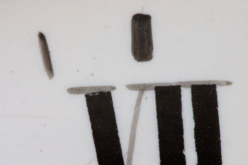
                              To get even closer to the hieroglyphics, I decided to use my Noveflex bellows and a macro lens (Canon EF100mm f/2.8 USM).

                              Just for fun I turned on the camera flash for the first shot, and was presented with this …

                              crw_7365---wehlen-&-co---ed.jpg

                              Paint contours !!!

                              Having turned off the flash because the lens was throwing a shadow, I only discovered the contours upon opening the few files in Photoshop CS3.

                              As for the real purpose of this thread, I'm still working through it.

                              Meanwhile, thanks for all your replies.

                              Sam

                              Thanks Michael. I knew I'd tried before but my memory ain't what it used to be.

                              #423407
                              Sam Stones
                              Participant
                                @samstones42903

                                Here are a couple of the other files via the bellows set up …

                                crw_7367---wehlen-&-co---ed.jpg

                                The clock face is slightly spherical, and with limited DOF, focus isn't the best.

                                crw_7368---wehlen-&-co---ed.jpg

                                This last one suggests (to me), that the cross lines and serifs were either the originals, a guide, and/or the black lines were added later.

                                Do the edges of the black lines suggest they were printed? I can't tell.

                                Sam

                                #423420
                                Michael Gilligan
                                Participant
                                  @michaelgilligan61133
                                  Posted by Sam Stones on 10/08/2019 02:40:49:

                                  Here are a couple of the other files via the bellows set up …

                                  [ … ]

                                  The clock face is slightly spherical, and with limited DOF, focus isn't the best.

                                  [ … ]

                                  This last one suggests (to me), that the cross lines and serifs were either the originals, a guide, and/or the black lines were added later.

                                  Do the edges of the black lines suggest they were printed? I can't tell.

                                  Sam

                                  .

                                  Excellent 'forensic' images, Sam yes

                                  The DOF could be increased [whilst maintaining high resolution] by stacking several images in 'Zerene'

                                  …. If you can produce the 'slices' I will happily stack them for you.

                                  MichaelG.

                                  Edited By Michael Gilligan on 10/08/2019 08:27:45

                                  #423432
                                  Michael Gilligan
                                  Participant
                                    @michaelgilligan61133
                                    Posted by Sam Stones on 10/08/2019 02:40:49:

                                    .

                                    crw_7367---wehlen-&-co---ed.jpg

                                    .

                                    I don't know what they are called, or whether they conform to a standard, but I'm almost certain that these marks are 'shorthand' to aid the painter when producing the 'signature'

                                    If I'm correct: The cross-bars indicate the height of the capital, and the curves indicate the width.

                                    Printers and Typographers use the terms en and em to describe widths … note any similarity ?

                                    .

                                    MichaelG.

                                    Edited By Michael Gilligan on 10/08/2019 09:47:15

                                    #423562
                                    Sam Stones
                                    Participant
                                      @samstones42903

                                      Phew! Who do I thank the most?

                                      Before I go on, I thought it worth mentioning, that other than the tiniest drop of (clock) oil where needed, the clock mechanism received no attention since I inherited it in December 1989. The marble case had been broken in several places, so I pulled that apart before gluing it back together. I can add nothing more as to its history.

                                      Thanks for your insight Bill (Phinn). Having never known or heard of rubrication, I thought it was a typo. The appearance of the characters suggests to me that the person who applied them was not particularly skilful, or applied the characters in a hurry. Then again the letter 'W' is little more than 2.5mm wide.

                                      Dave (SOD) – I like your ideas. A hint of graffiti perhaps? The paint has rubbed off at some stage, and what looks like Fr is actually a capital ‘G’.

                                      34046 – Yes, I found it, thank you. The number of clock and watchmakers is overwhelming.

                                      Thanks Brian (H). Your comments and MichaelG’s ‘revelation’ as to the possible connection with ‘sign-writer’s shorthand’ both come very close to a solution.

                                      Nick – That’s a very helpful insight. I’m sure too, your book will be a valuable addition to anyone’s personal library. I’d love to find and read it. Meanwhile, I searched the public library catalogue, but it didn’t show. Could you guess an age for the clock please?

                                      AdrianR – Thanks for your efforts in searching those categories.

                                      Brian (S) – Thanks for throwing extra light on this challenge. I had a quick shufti through the symbol list of MS Word (>2800). There were tantalising similarities but nothing positive.

                                      Michael G – Many thanks for your ‘stacking’ offer. If only Photoshop CS3 would work. For several broad ranging reasons, I have contemplated buying Zerene or Helicon Focus but … I’ve entered into the process of downsizing most of my stuff, and unlikely to get there.

                                      Also Michael – I googled Signwriter Shorthand and found these …

                                      **LINK**

                                      They are even more alluring than the MS Word list.

                                      Thanks again for your contributions.

                                      Best wishes,

                                      Sam

                                      Edited By Sam Stones on 11/08/2019 03:46:52

                                      #423576
                                      SillyOldDuffer
                                      Moderator
                                        @sillyoldduffer

                                        Sorry to pour cold water on Signwriter Shorthand! Although the symbols look promising, don't they relate to signing as used by deaf people to communicate rather than sign writing as in shop facades and clock faces? They're a 20th century innovation unlikely to be on a 19th century clock.

                                        Like seeing castles in the flames there's always danger of joining the dots wrongly, so I'm not convinced my Hebrew suggestion is right either. Note how I mistook 'G' for 'Fr'! However they do resemble the characters Alef, Kaf, Yod, Pay and Bet turned by 90°. One character is too damaged to guess.

                                        First right way up, then turned as on the clock:


                                        hebrew.jpg

                                        Any Hebrew scholars out there?

                                        Dave

                                        Edited By SillyOldDuffer on 11/08/2019 08:24:48

                                        #423578
                                        Michael Gilligan
                                        Participant
                                          @michaelgilligan61133
                                          Posted by SillyOldDuffer on 11/08/2019 08:24:16:

                                          Sorry to pour cold water on Signwriter Shorthand! Although the symbols look promising, don't they relate to signing as used by deaf people to communicate rather than sign writing as in shop facades and clock faces?

                                          .

                                          Sam has nicely demonstrated the perils of using a 'machine' to search for a concept

                                          The words we have in our head may not match the words in its algorithm.

                                          [ I too am running-out of plausible search terms ]

                                          MichaelG.

                                          #423586
                                          SillyOldDuffer
                                          Moderator
                                            @sillyoldduffer

                                            I like my idea the clock face has been "signed" by the painter. Sound engineers sometimes scratched personal messages in the blank shiny space on vinyl records just after the final track. I remember one 45 signed 'Porkies Prime Cut'. Perhaps it's instinctive to personalise one's achievements, just as dogs pee on lampposts to mark their territory, but it may not be meaningful unless you're Picasso…

                                            Another theory, Sam asked if the broad strokes on his Latin numerals were printed. The rest of the clock markings look hand painted to me. My guess is the numerals were first outlined by hand, and then something like a rubber stamp was used to add consistent broad strokes to embolden the straight bits. Printed yes, but not by a machine. Comparing the magnified outline of several broad strokes might prove the point because a stamp could have a consistent flaw that's repeated on all of them.

                                            Dave

                                            #423587
                                            Michael Gilligan
                                            Participant
                                              @michaelgilligan61133
                                              Posted by Sam Stones on 09/08/2019 00:11:00:img_0382---wehlen-&-co - ed.jpg

                                              .

                                              Anything's possible, Dave

                                              … but my bet is still on the marks being some sort of shorthand for the size and style of the four capitals.

                                              MichaelG.

                                              .

                                              .

                                              P.S. [slight digression] http://siliconzoo.org is not playing nicely on my iPad, but this is worth a look:

                                              https://www.olympus-lifescience.com/en/microscope-resource/primer/virtual/virtualzoo/

                                              Edited By Michael Gilligan on 11/08/2019 09:53:52

                                              #423608
                                              SillyOldDuffer
                                              Moderator
                                                @sillyoldduffer
                                                Posted by Michael Gilligan on 11/08/2019 09:41:43:

                                                Posted by Sam Stones on 09/08/2019 00:11:00:

                                                .

                                                Anything's possible, Dave

                                                … but my bet is still on the marks being some sort of shorthand for the size and style of the four capitals.

                                                MichaelG.

                                                .

                                                .

                                                P.S. [slight digression] **LINK** is not playing nicely on my iPad, but this is worth a look:

                                                **LINK**

                                                Thanks for the link, Daffy Duck etched in miniature on an Integrated Circuit indeed!

                                                I like your idea too, not least because it explains the three horizontal lines. Is it a coincidence that in this list of modern proofreading symbols, 3 bars means 'Put this in Capitals'?

                                                Sam's question has me wondering if other old clock faces ever feature strange markings? A quick scan through the catalogues of antique clock sellers was disappointing because the photos aren't good enough to decode the interesting blurs.

                                                Dave

                                                #423676
                                                Nick Clarke 3
                                                Participant
                                                  @nickclarke3
                                                  Posted by SillyOldDuffer on 11/08/2019 11:14:22:

                                                  I like your idea too, not least because it explains the three horizontal lines. Is it a coincidence that in this list of modern proofreading symbols, 3 bars means 'Put this in Capitals'?

                                                  Sam's question has me wondering if other old clock faces ever feature strange markings? A quick scan through the catalogues of antique clock sellers was disappointing because the photos aren't good enough to decode the interesting blurs.

                                                  Dave


                                                  I am sorry but I cannot give you a correct answer.

                                                  For more that the last thirty years I have been involved in teaching, lecturing and studying typography, and I have never seen anything that matches these exactly. Firstly the proofreader's mark for capitals is marked underneath the text not above it. (I used to work for a guy who was a craft proofreader and Eric would mark up any memo sent to him to be corrected!!) There are several reasons why I can't concur with the suggestions already given.

                                                  Firstly the marks are not over all capitals, and if they indicate capitalisation why are the first two different? Also the third one is over the abbreviation for company and, while there are dots above the second row they are not only above the capitals and finally why paint on these symbols when you could paint on the words themselves! I would suggest that giving typographical instructions which are intended for printers would mean little or nothing to a guy with a brush.

                                                  I still don't know what they are, but I cannot see that they would be typographical. I just don't see it.

                                                  Edited By Nick Clarke 3 on 11/08/2019 20:14:40

                                                  #423685
                                                  Michael Gilligan
                                                  Participant
                                                    @michaelgilligan61133
                                                    Posted by Nick Clarke 3 on 11/08/2019 20:11:

                                                    [ … ] For more that the last thirty years I have been involved in teaching, lecturing and studying typography, and I have never seen anything that matches these exactly. Firstly the proofreader's mark for capitals is marked underneath the text not above it. (I used to work for a guy who was a craft proofreader and Eric would mark up any memo sent to him to be corrected!!) There are several reasons why I can't concur with the suggestions already given.

                                                    Firstly the marks are not over all capitals, and if they indicate capitalisation why are the first two different? Also the third one is over the abbreviation for company and, while there are dots above the second row they are not only above the capitals and finally why paint on these symbols when you could paint on the words themselves! I would suggest that giving typographical instructions which are intended for printers would mean little or nothing to a guy with a brush.

                                                    I still don't know what they are, but I cannot see that they would be typographical. I just don't see it.

                                                    .

                                                    I am in no position to argue with a man of your experience, Nick

                                                    But I do have a few observations [assuming that your reply was not meant exclusively for Dave]

                                                    The marks are over all of the 'feature' [for want of a better word] capitals in the Signature [i.e.the bit that is particular to this job.

                                                    My hypothesis is that:

                                                    1. the three lines show these to be 'full height' [wheras the rest of the signature is in 'small caps']
                                                    2. the marks below the lines show the width of that large capital, and also the style of the subscript, etc.that accompanies it.
                                                    3. the marks are the dial-painter's own … for his convenience [just like we use 'construction lines' in drawing].

                                                    Looking at them in context … I feel that I can almost 'read' them myself, intuitively.

                                                    MichaelG.

                                                    #423687
                                                    Michael Gilligan
                                                    Participant
                                                      @michaelgilligan61133
                                                      Posted by Sam Stones on 09/08/2019 00:11:00:
                                                      .img_0382---wehlen-&-co - ed.jpg

                                                      .

                                                      Quoted again, for convenient reference on this new page.

                                                    Viewing 25 posts - 1 through 25 (of 60 total)
                                                    • Please log in to reply to this topic. Registering is free and easy using the links on the menu at the top of this page.

                                                    Advert

                                                    Latest Replies

                                                    Viewing 25 topics - 1 through 25 (of 25 total)
                                                    Viewing 25 topics - 1 through 25 (of 25 total)

                                                    View full reply list.

                                                    Advert

                                                    Newsletter Sign-up